K.T.M
WELCOME TO KTM, A MULI-HYPERNATE PORTFOLIO FOUNDED BY MAKAFUI, A GHANAIAN-ITALIAN ASPIRING ARTIST AND WRITER BASED IN OXFORD, HEADINGTON. KTM IS WHERE MAKAFUI EXPLORES SOFTNESS, MEMORY, AND IDENTITY THROUGH PAINTING, COLLAGE, DIGITAL ART, AND WRITING.WHETHER WORKING WITH DIGITAL ART, MIXED MEDIA, OR SET DESIGN, THE ART BRINGS A SUBTLE, INTUITIVE APPROACH TO EACH PROJECT, BALANCING ARTISTIC DEPTH WITH CLEAN, ELEGANT EXECUTION, OFFERING THOUGHTFUL VISUALS THAT LINGER LONG AFTER THE IMAGE FADES.
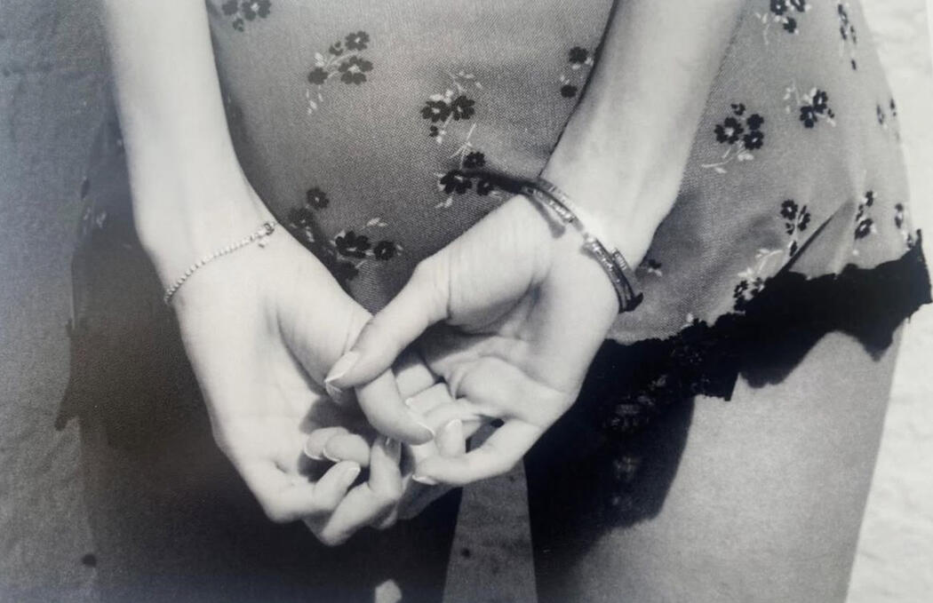
thank you for being here!
HIII! It's Makafui, I go by Makafui my Twi name as an artist (since you're here just call me Michela) I’m an Interior Architecture student living in one of the quietest corners of the United Kingdom. Life here moves slowly, which is a pace I have always been drawn to, it has taught me to find joy in stillness.I’m someone who craves alone time and silence; but I also deeply value quality time with the people I love. I listen attentively, talk fairly queitly (if you get to know me I can be loud), and I always show up with care (although I struggle with expressing how I feel most times). Still, I make sure to be there for others, whether through conversation, presence, or a shared meal, which is something I hold close.I love cats, taking care of children, and cooking for the people I care about. There’s something sacred about feeding people. I enjoy editing and just bringing things into life, walking long distances just to think, and discovering new places in my small town. I write and read during my free time, or spend hours debating discourses, theories, or the state of the world with friends (which is probably the only way to get me talking for more than twenty minutes, since I’m usually someone of few words).I grew up watching family channels and video essays, which shaped my empathy and who I am.I’m an intersectional feminist at heart, a Marxist in soul, and a Pan-Africanist by nature. I carry a little bit of everything (honestly I can't stop thinking). My worldview is shaped by theory and experience, a mix of head and heart that guides how I live and create.More than anything, I love soft pleasures: fresh air through the window, warm sun on my face, discovering a quiet café or hidden corner in my town; you’ll most likely find me wandering galleries and bookstores, collecting stationery I’ll never use and saving jewellery on Pinterest boards. I love observing the world more than being in the center of it (when I care about something, I care deeply). All of these small joys of solitude, of connection, of care are what shape who I am, far beyond my art.
thank you for being here!
YEAR 1 SEMESTER 1
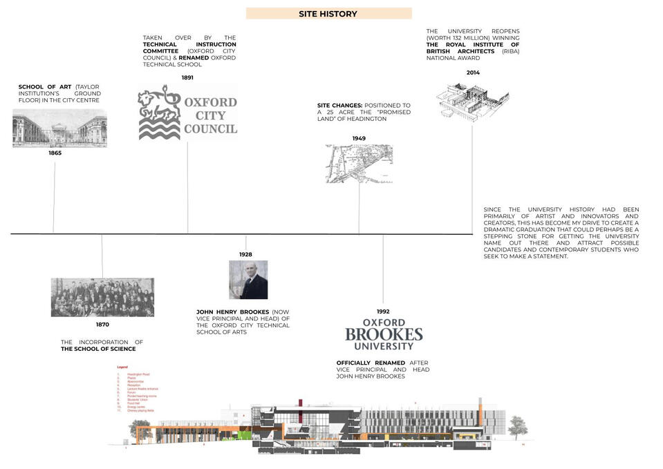
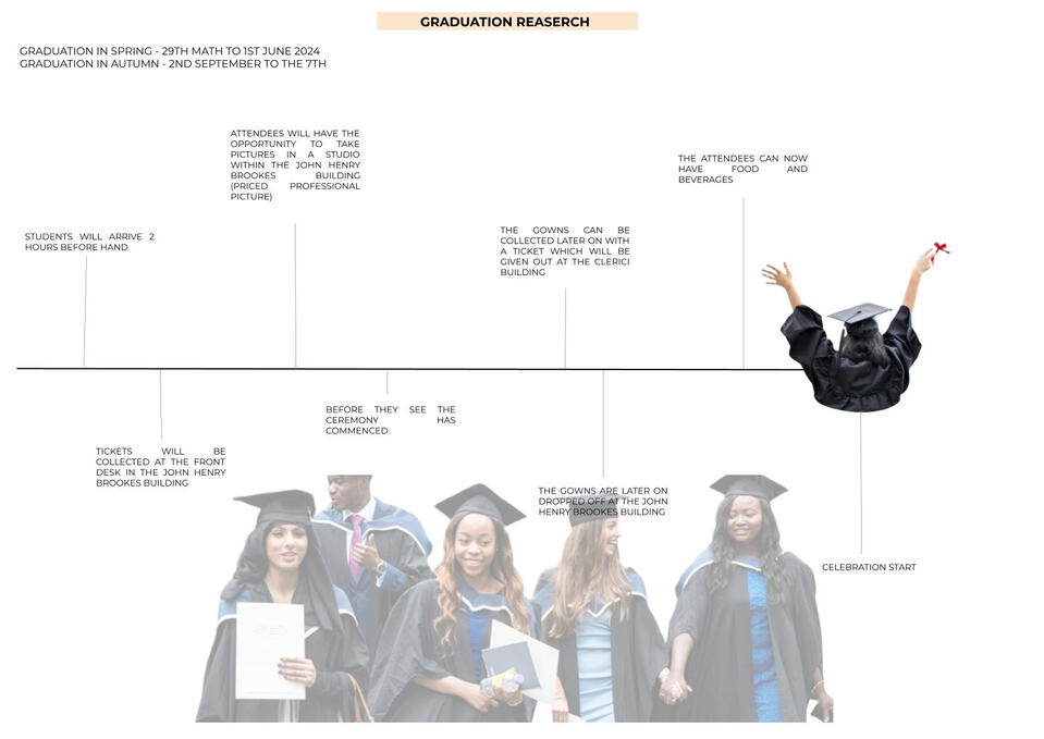
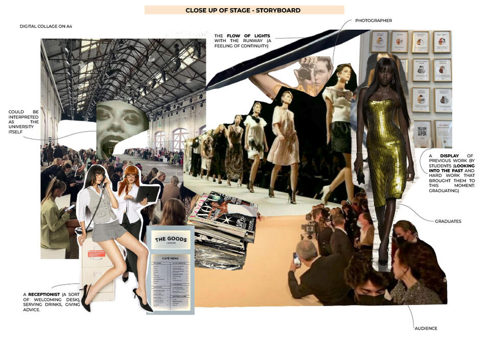
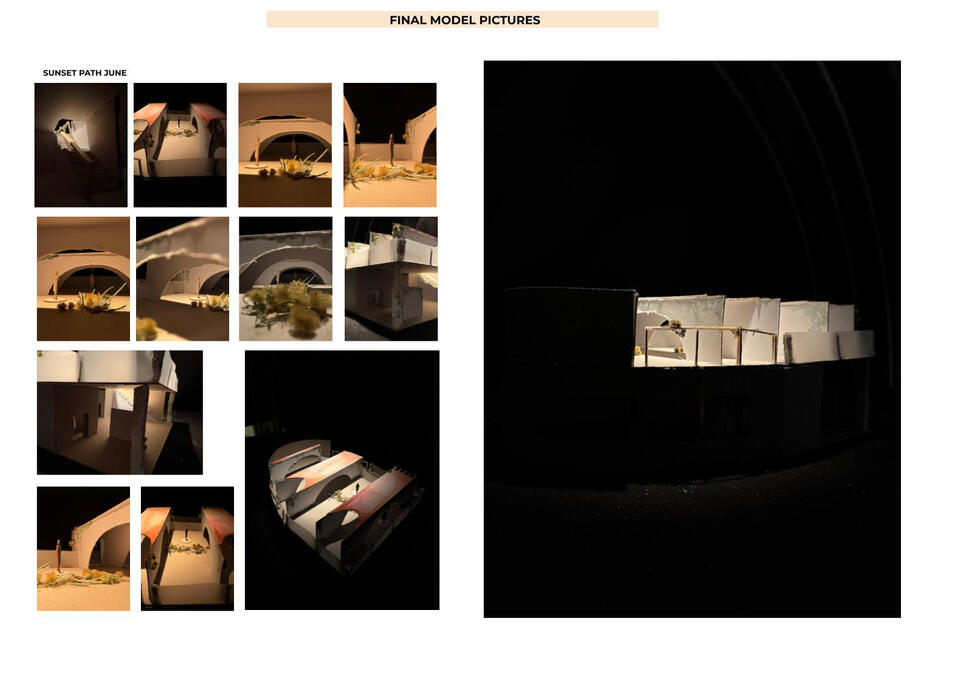
One of the most meaningful parts of my 1st year architecture: the self-directed Semester 1 Project 2, the Graduation Station,’ titled Summer Solstice.The brief challenged to design a graduation space that was: easily demountable and reconfigurable, inclusive and accessible, economically and environmentally sustainable.
I approached the brief a prom like experience and narrative for graduates who missed out, offering a space that brings a sense of closure. Inspired by the work of luxury wedding planner Ziad Nassar. I drew from his ability to create sultry climates and alluring atmospheres that blend opulence with nature.
YEAR 1 SEMESTER 2
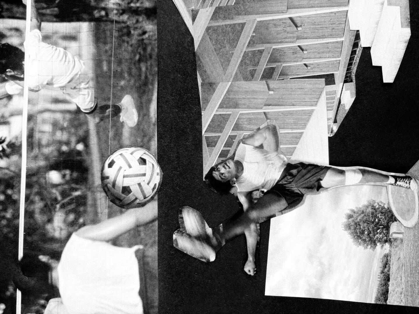
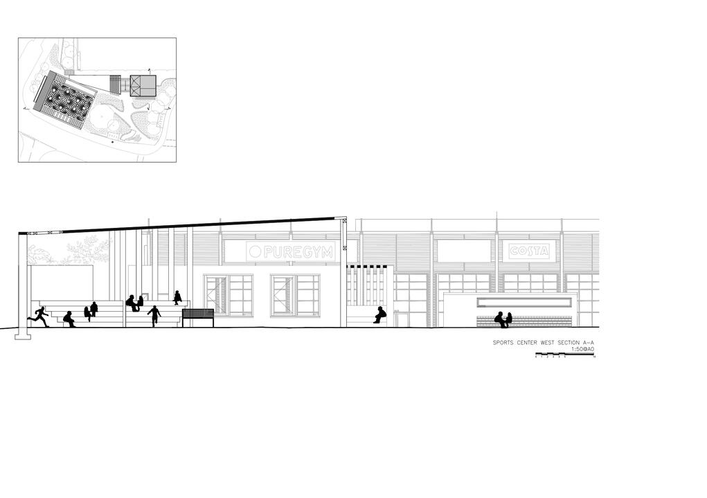
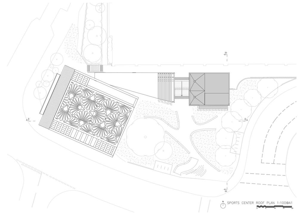
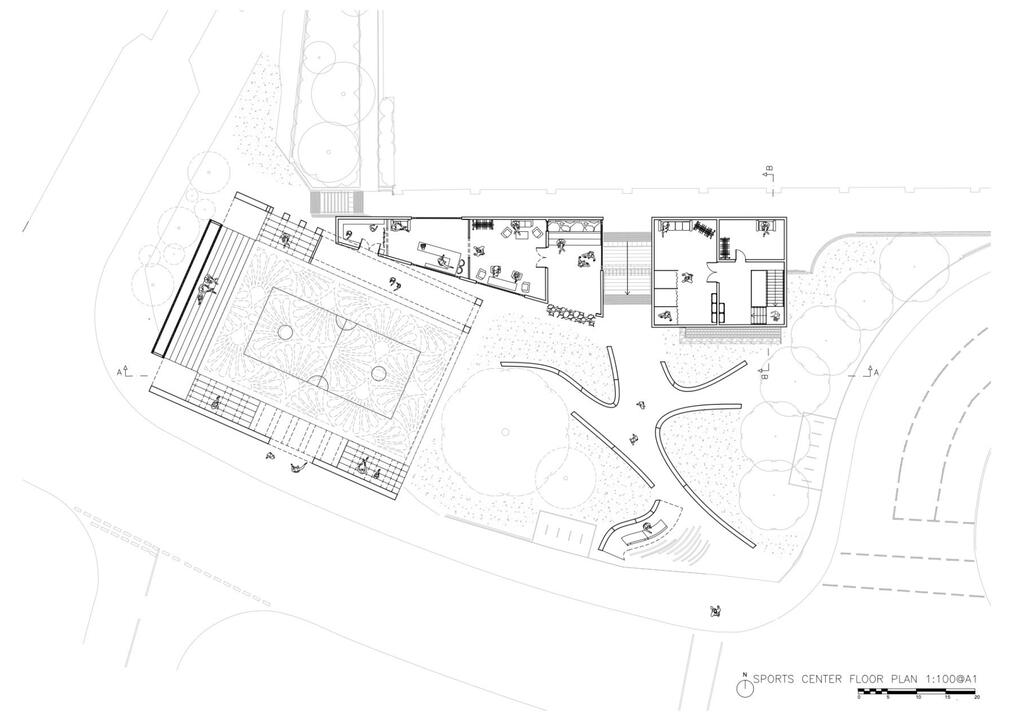
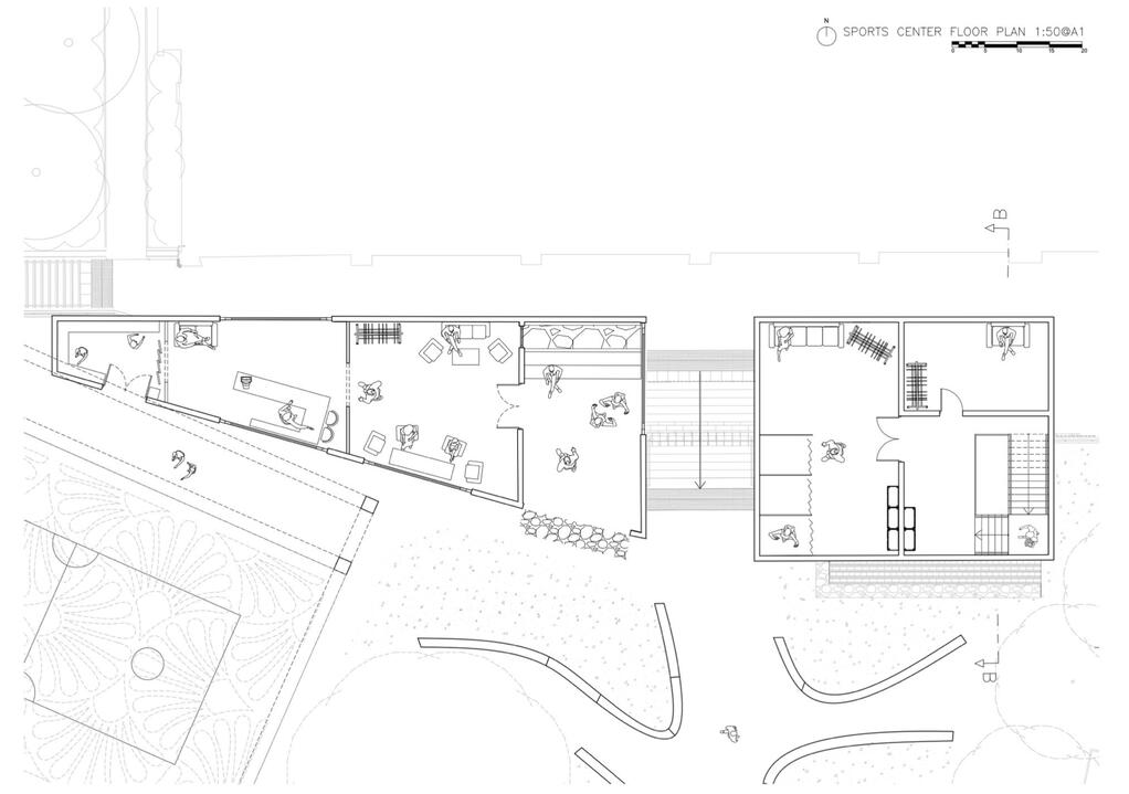
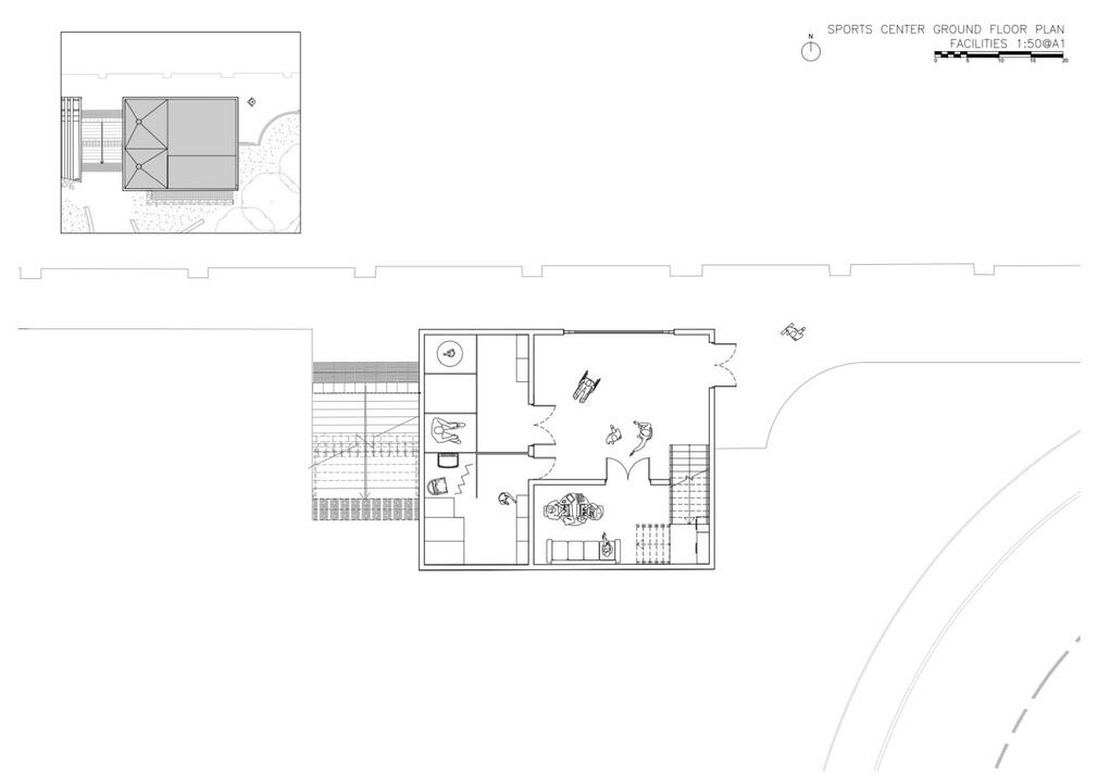
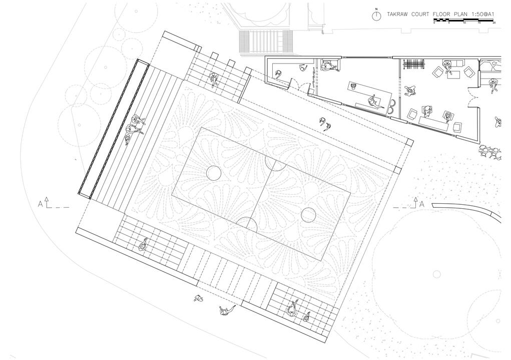
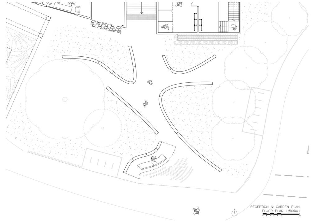
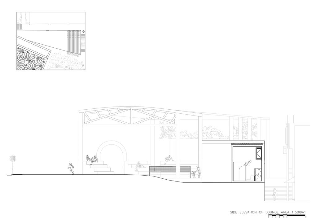
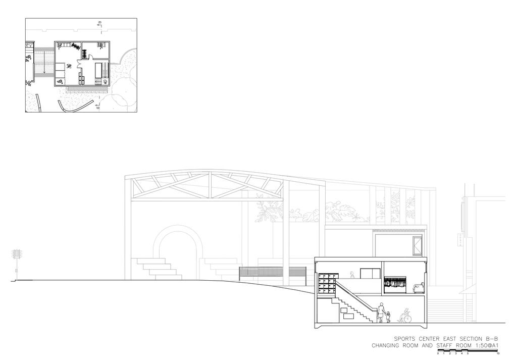
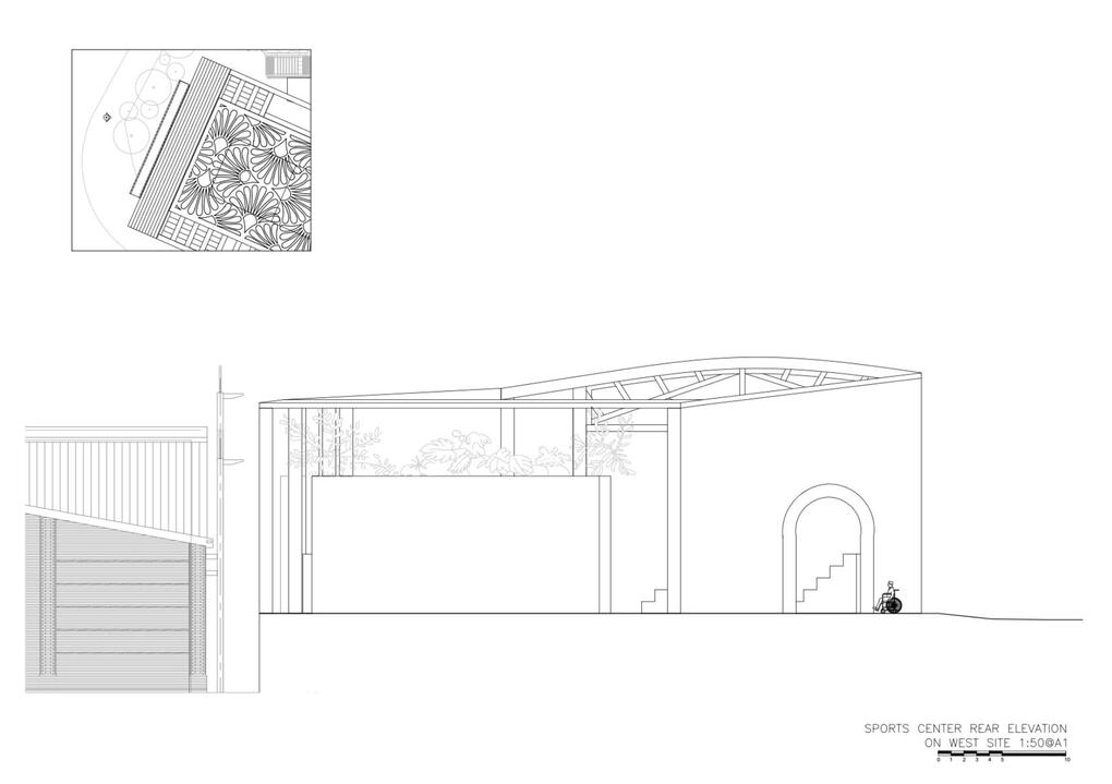
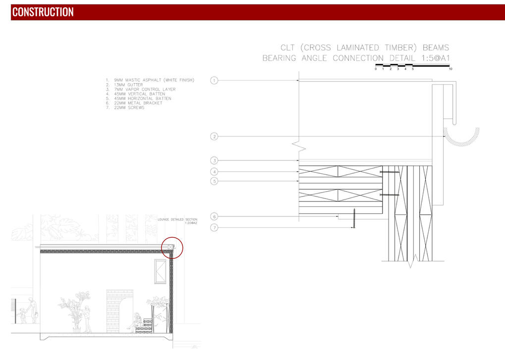
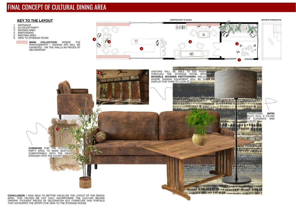
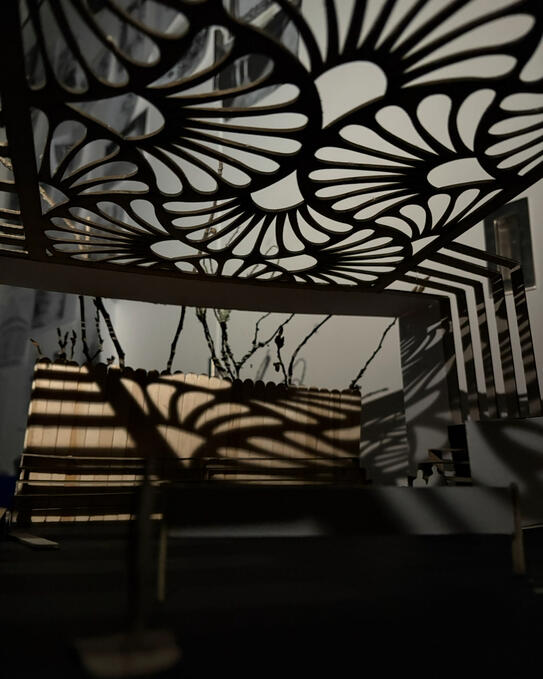
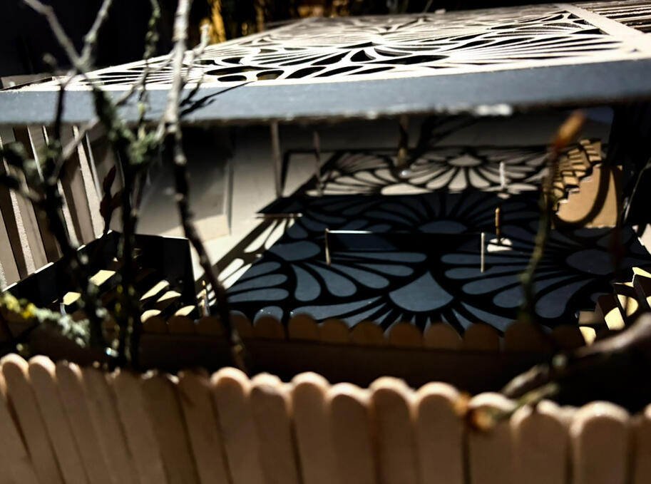
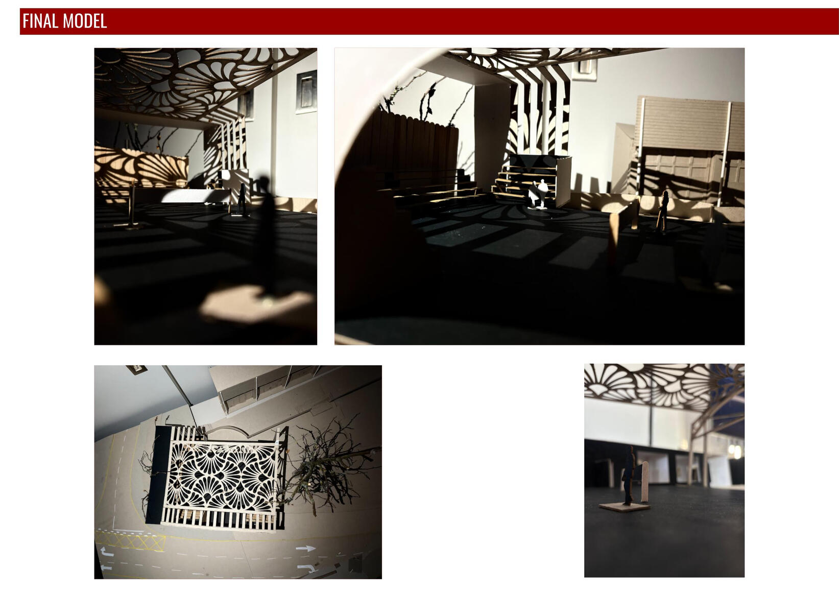
Another meaningful part of my 1st year architecture: the Year 1 Semester 2 Project, For the Love of the Game A Place for (Active) Play,' titled Cowley Sport & Games Centre.The brief challenged a design that was inclusive, encouraging of active bodies, diverse and accessible, socially and culturally considered, and open to all abilities, ages, and mobility needs.I approached the brief through the lens of Sepak Takraw: a Malay sport that became personally significant to me after moving to university, where I was warmly welcomed by that community and formed meaningful friendships. This connection gave me a sensitivity in my design approach, allowing me to go beyond aesthetics and embed real cultural identity into the architecture.Takraw's flexibility-led physicality made it a natural fit for the children of Cowley, a predominantly residential area where the sport's accessibility for younger, more flexible players felt genuinely appropriate.The design responds to this through a carved textile-patterned roof drawn from traditional Malay textile (Batik), pieces of cultural decoration, and carefully considered furniture and portals that anticipate the movement of the sport, including an enfilade effect directing the eye toward the storage room and through the dining area.
YEAR 2 SEMESTER 1
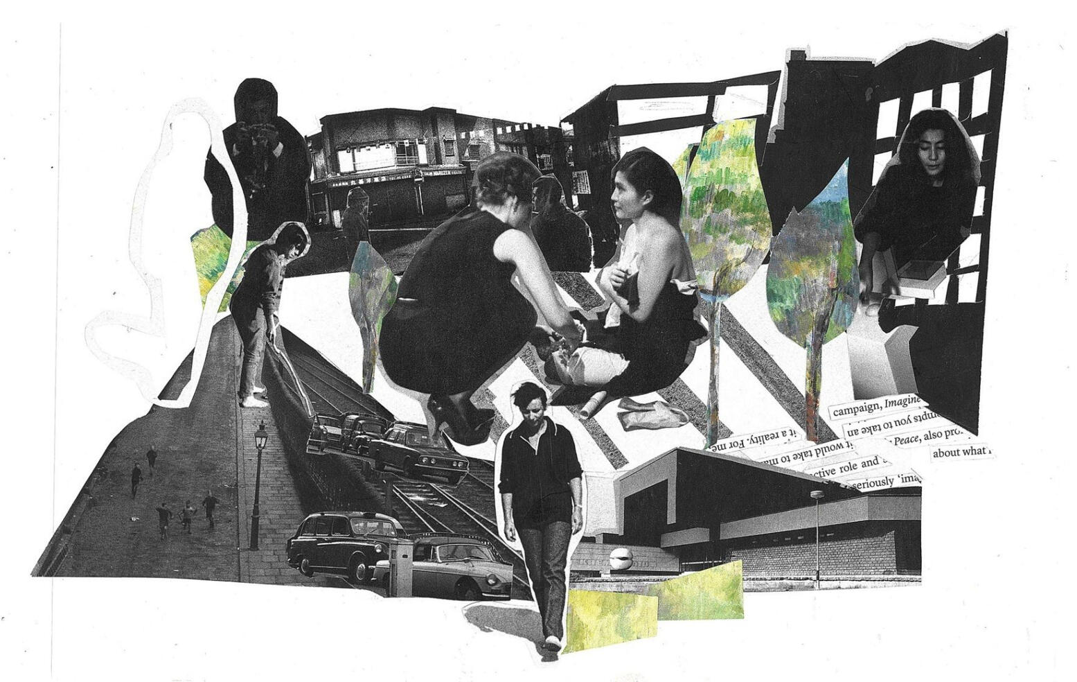
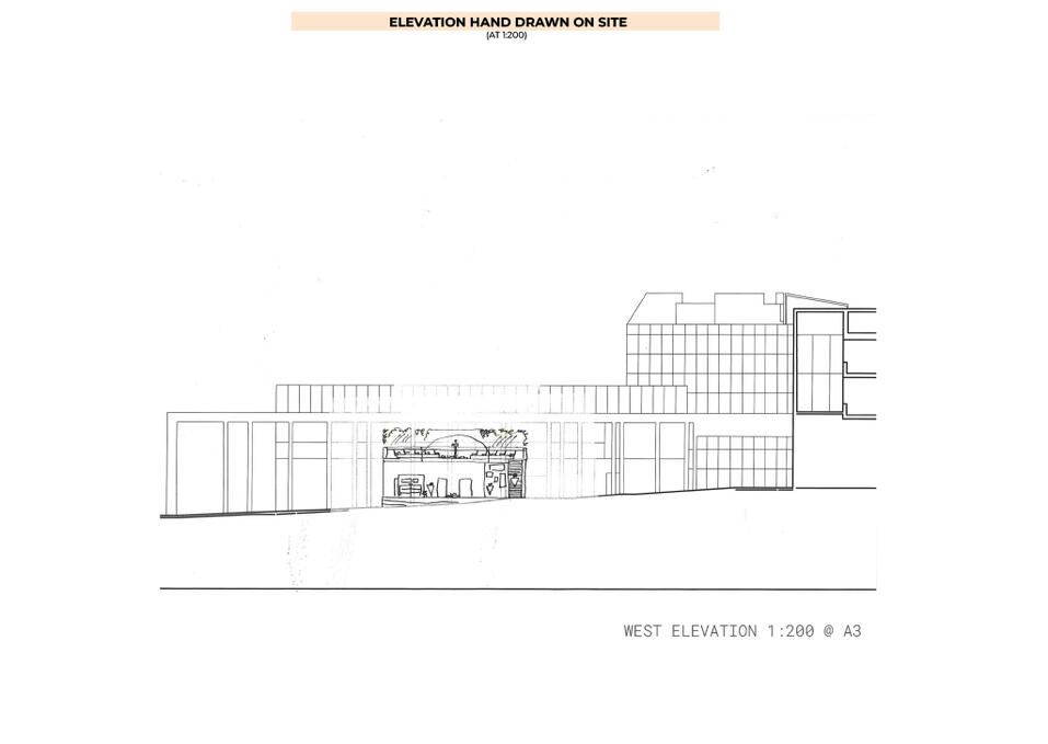
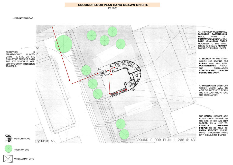
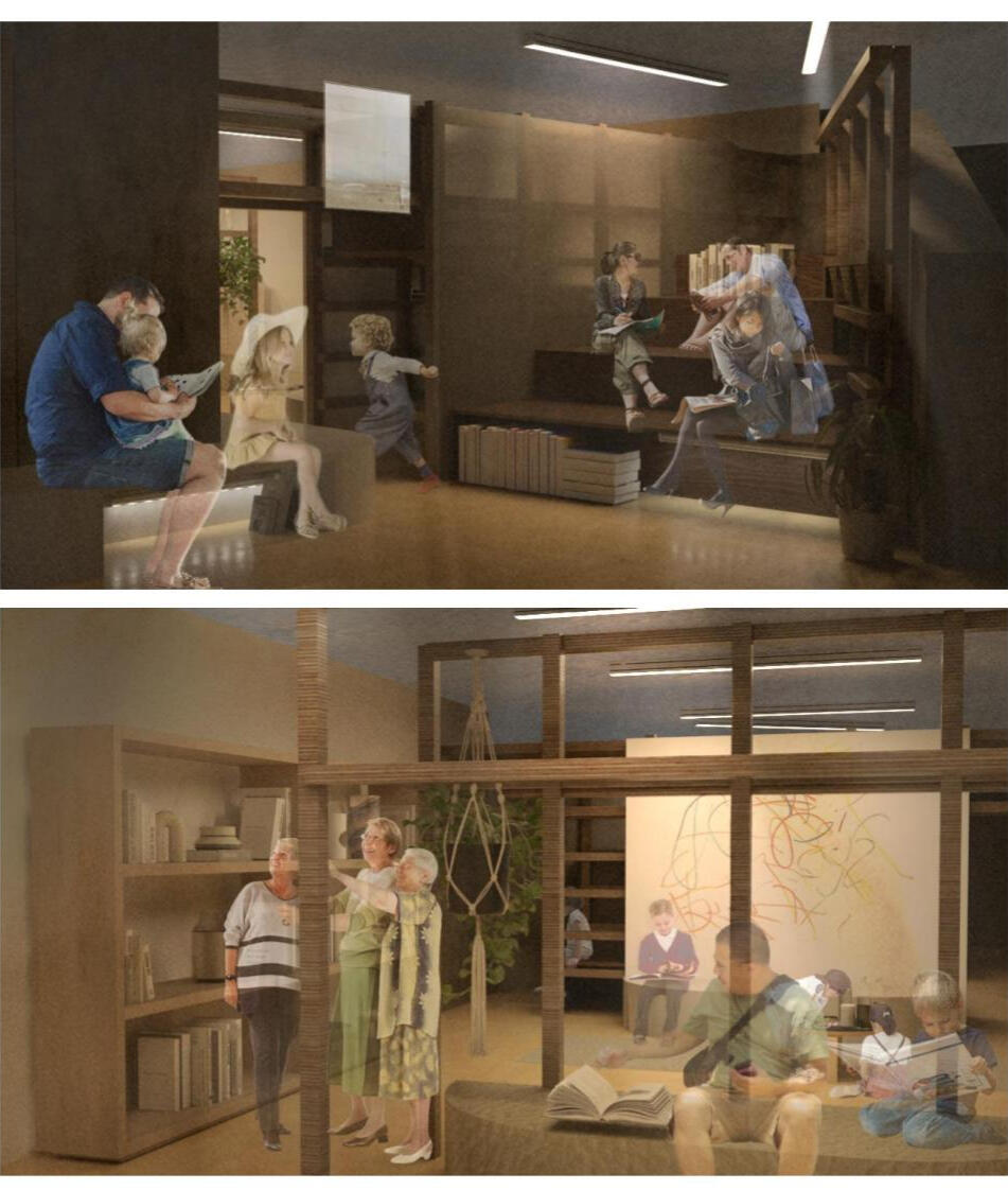
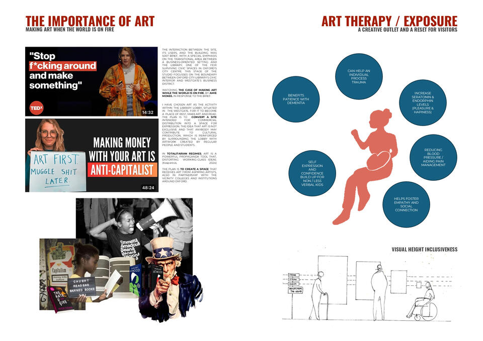
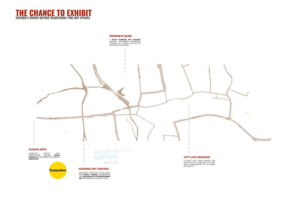
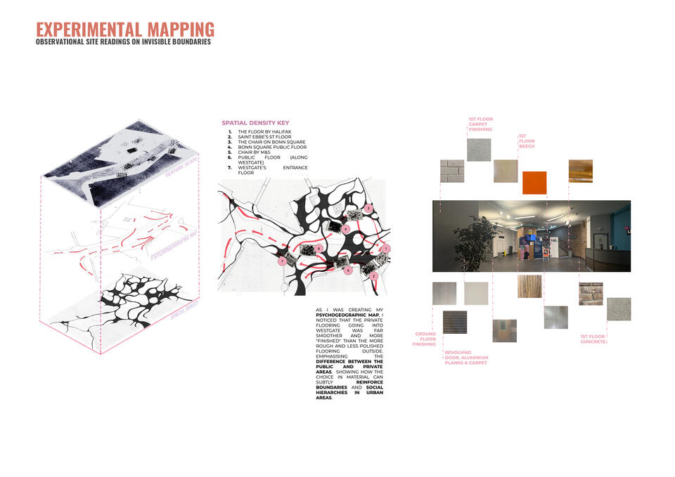
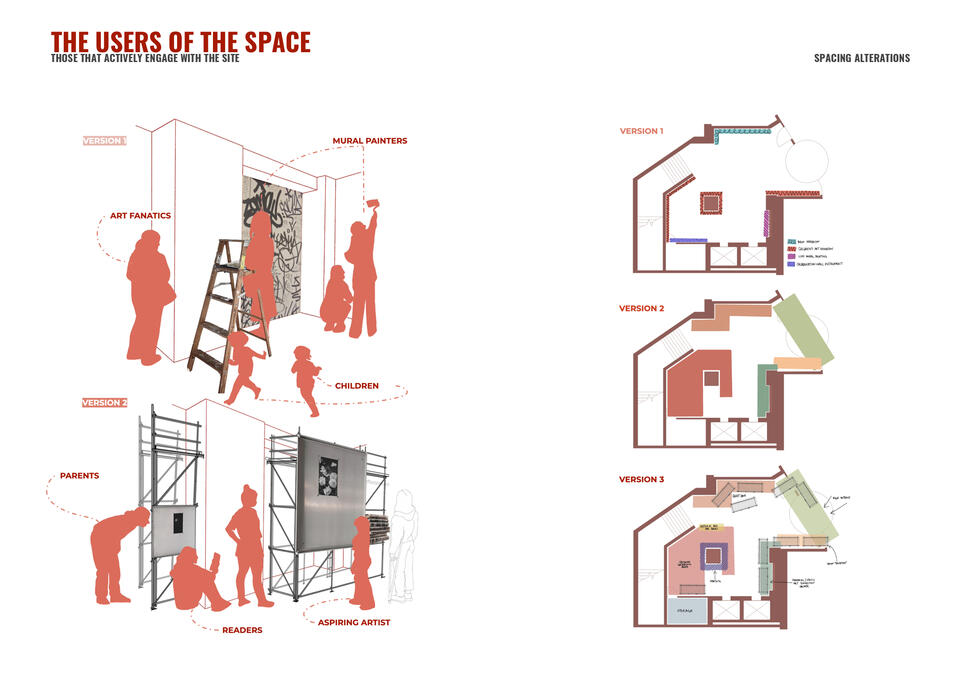
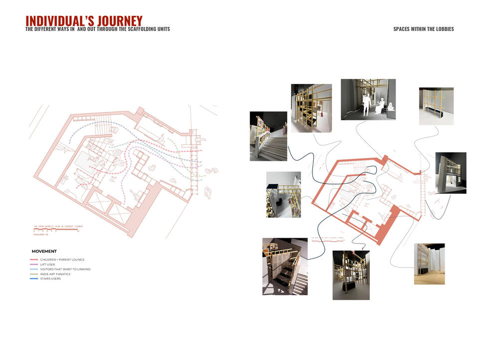
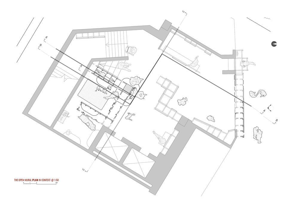
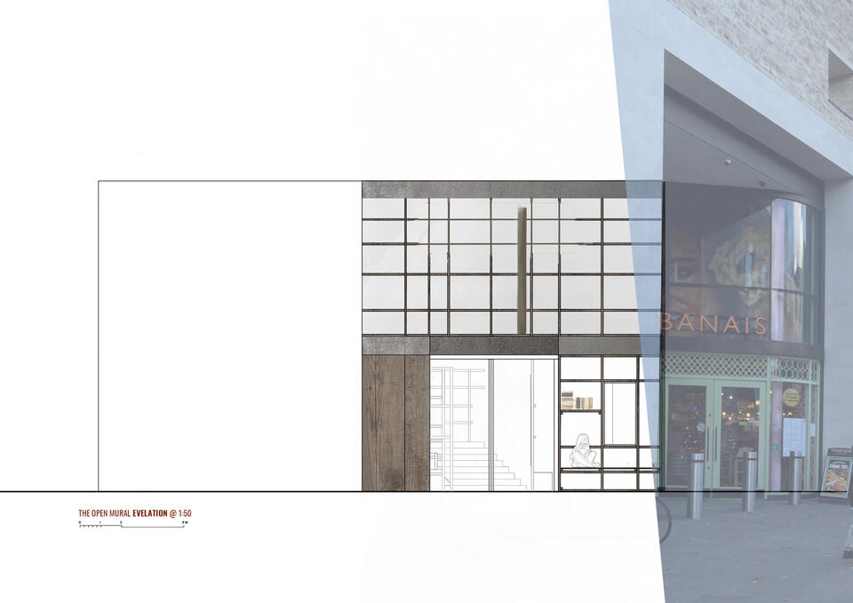
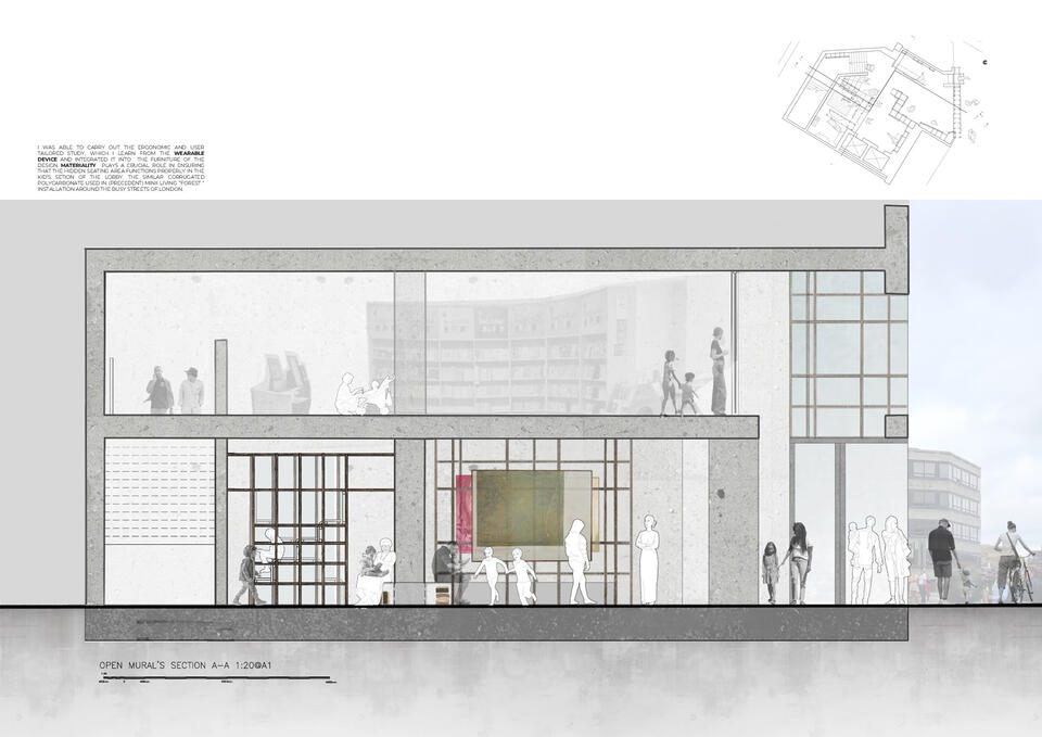
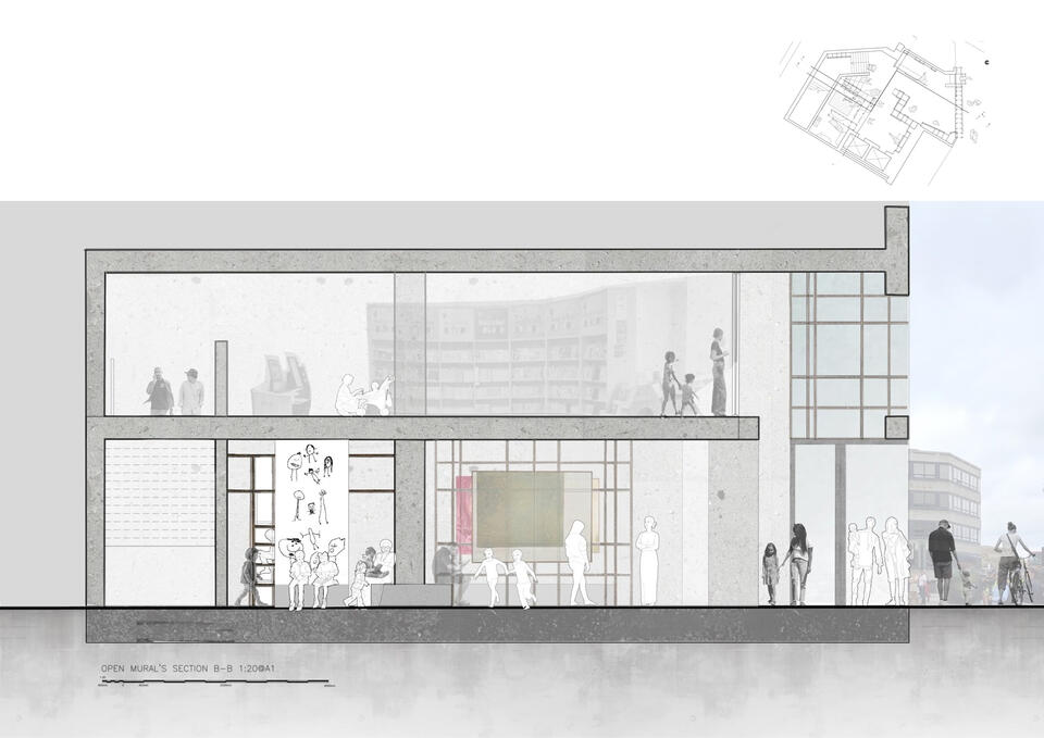
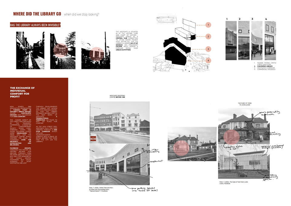
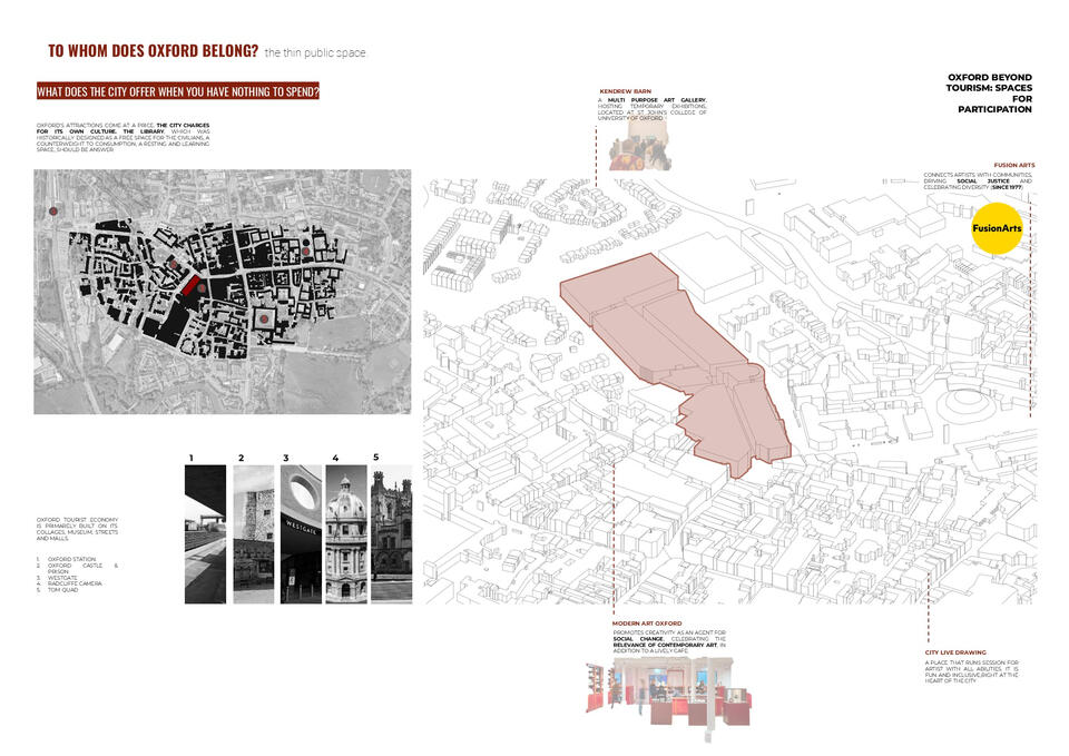
Marking my formal transfer from BA Architecture to BA Interior Architecture, the Year 2 Semester 1 Project, Westgate Public Library, titled The Open Mural.The brief challenged to interrogate: the necessity of libraries in a digital world, the shifting cultural and political responsibilities of collections, and the spatial design of inclusive knowledge repositories centred on the reorganisation and enhancement of Oxford's Westgate Public Library.I approached the brief through the lens of art as civic resistance inspired by Amie McNee's TEDTalk Making Art While the World is on Fire. Rather than a conventional redesign, I proposed converting the library lobby, a transitional space sitting between Oxford's civic interior and Westgate's commercial district, into a place of rest, making, and reading: reclaiming a commercially intended site as one of expression.The design is rooted in the belief that art is not exclusive, anyone can contribute to cultural production. The lobby becomes a living gallery of work by everyday people, students, and partner colleges and institutions across Oxford, blurring the boundaries between what is considered acceptable in public versus private space.Drawing on Kasparova's writing on totalitarianism and art as propaganda, the project pushes back, creating an outlet where so-called rebellious behaviour is not only welcomed but architecturally anticipated.The proposal explores the in-between, the threshold of the urban and the civic, merging two worlds so that the library lobby becomes a space where everyone can benefit from the quiet, radical power of being exposed to art.
MATERIAL EXPLORATION
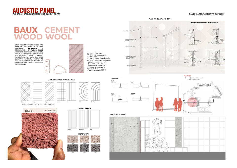
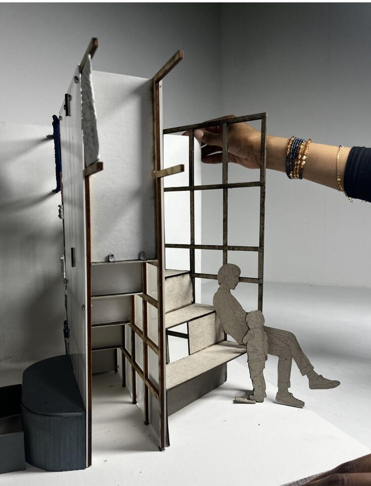
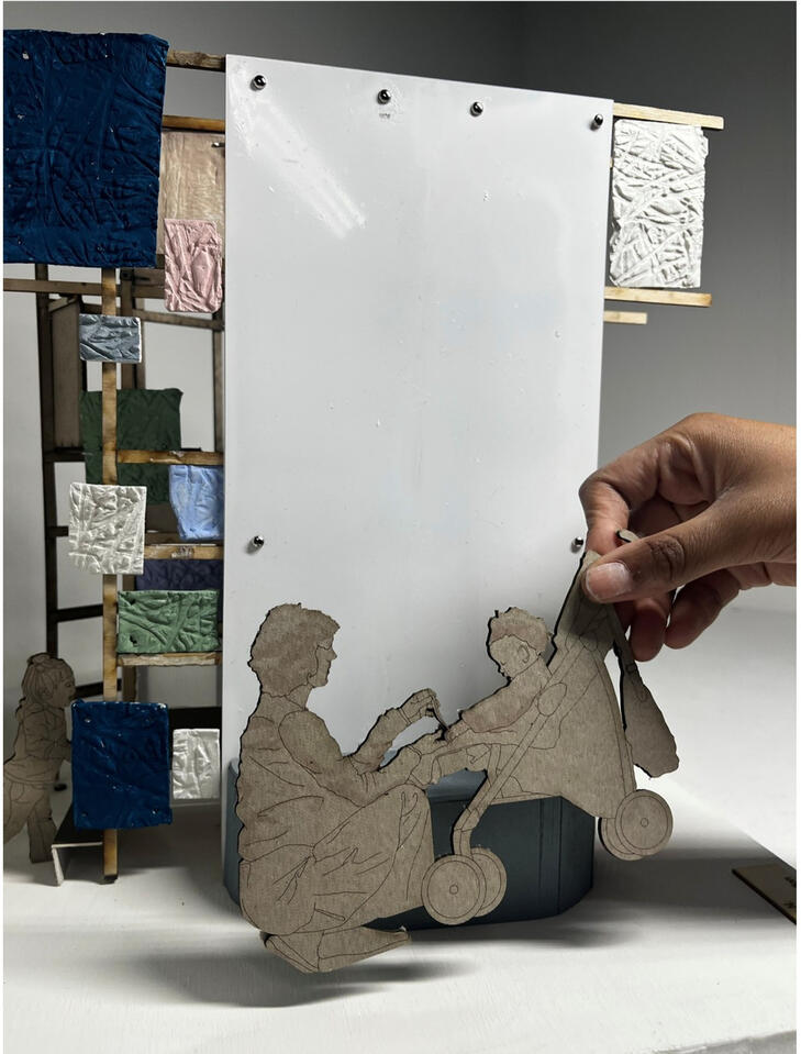
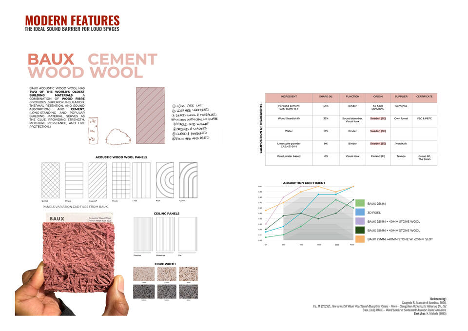
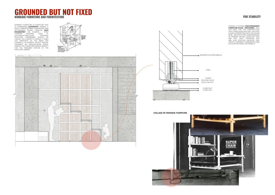
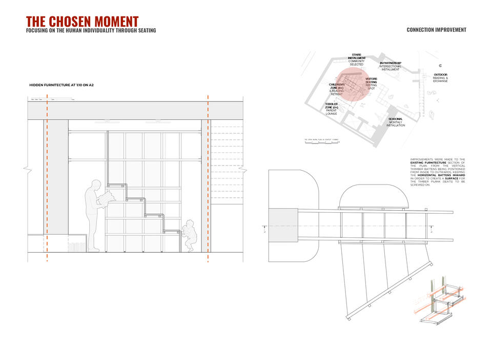
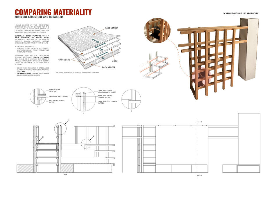
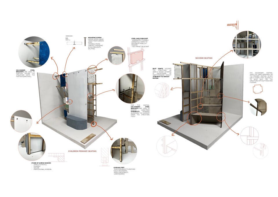
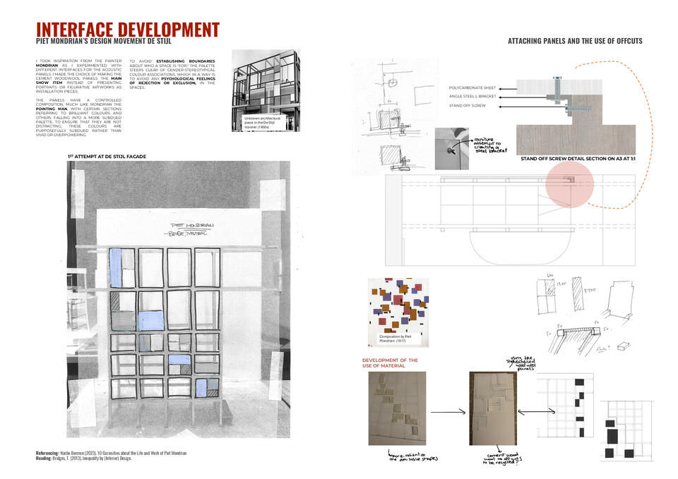
Forensic Research into Wood Wool, leading to a 1:10 Prototype Moment, semester 1 research across semester 2.Discovered through a visit to the Material Lab in London, where I discovered BAUX a Swedish company known for re imagining wood wool as an architectural acoustic surface, drew me in for its material qualities that are simultaneously warm, tactile, sustainable, and textured.I chose to sandwich it within the threshold between the staircase seating and the children's corner in the lobby, using it to define territory softly without hard division.For construction, my goal was a non-permanent, furniture-scale grounding, levelling feet with a nylon base to protect the host floor while maintaining full architectural independence. A small but considered detail: levelling feet in modern interiors are not just technical they are political, enabling a transient, ownership-free occupation that prioritises mobility and impermanence.
YEAR 2 SEMESTER 2
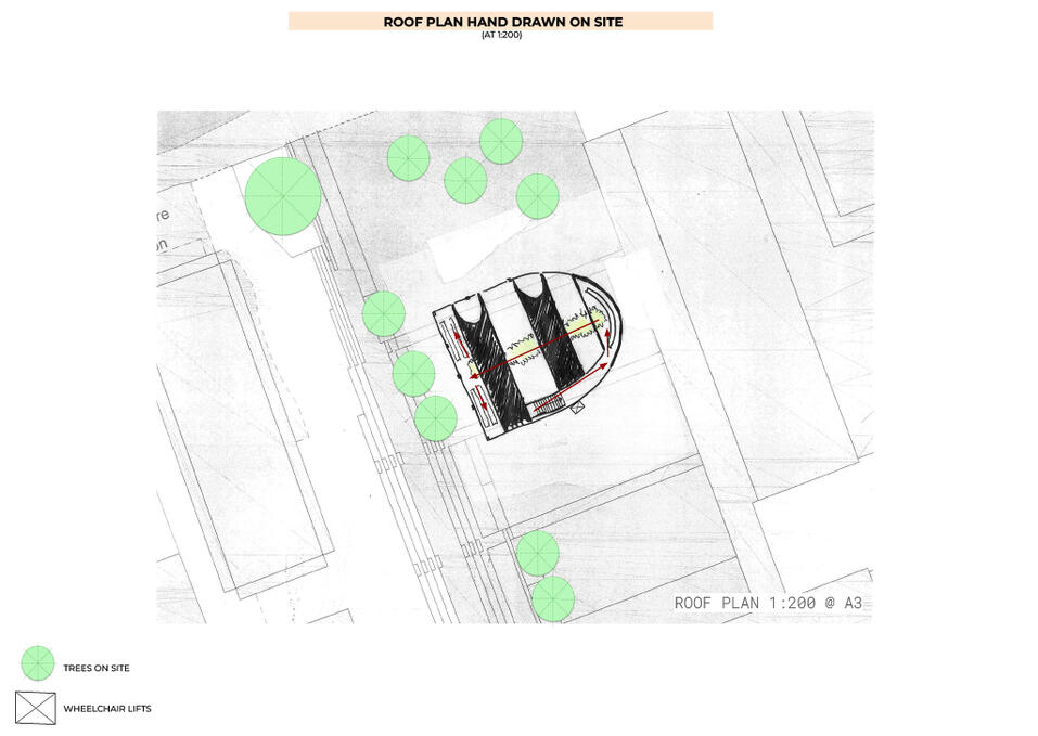
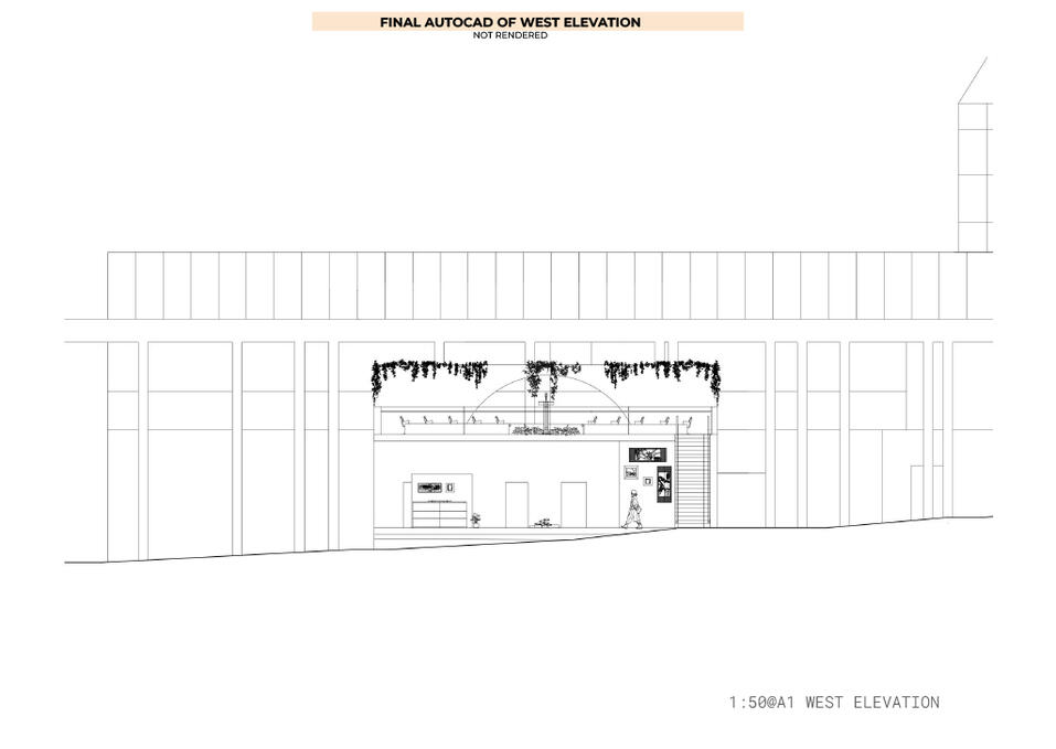
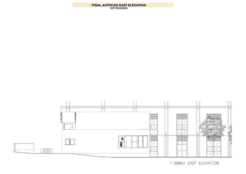
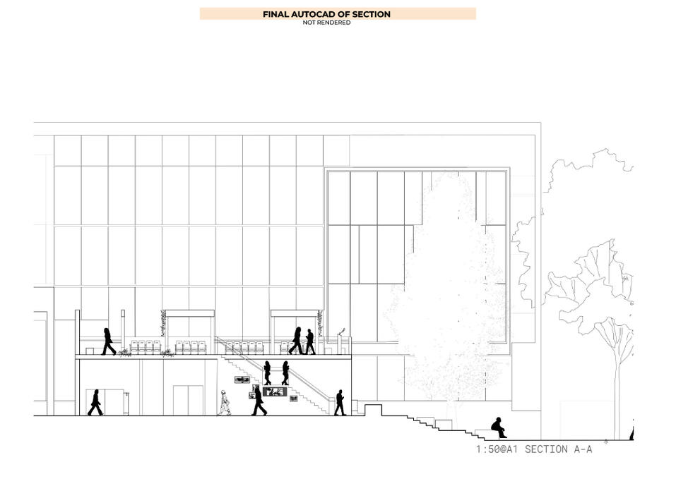
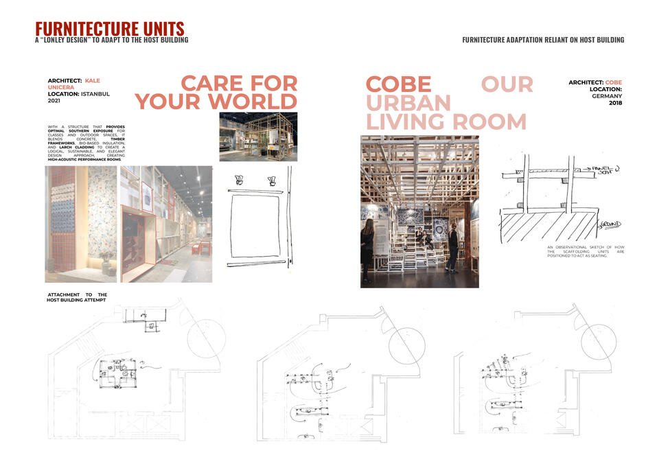
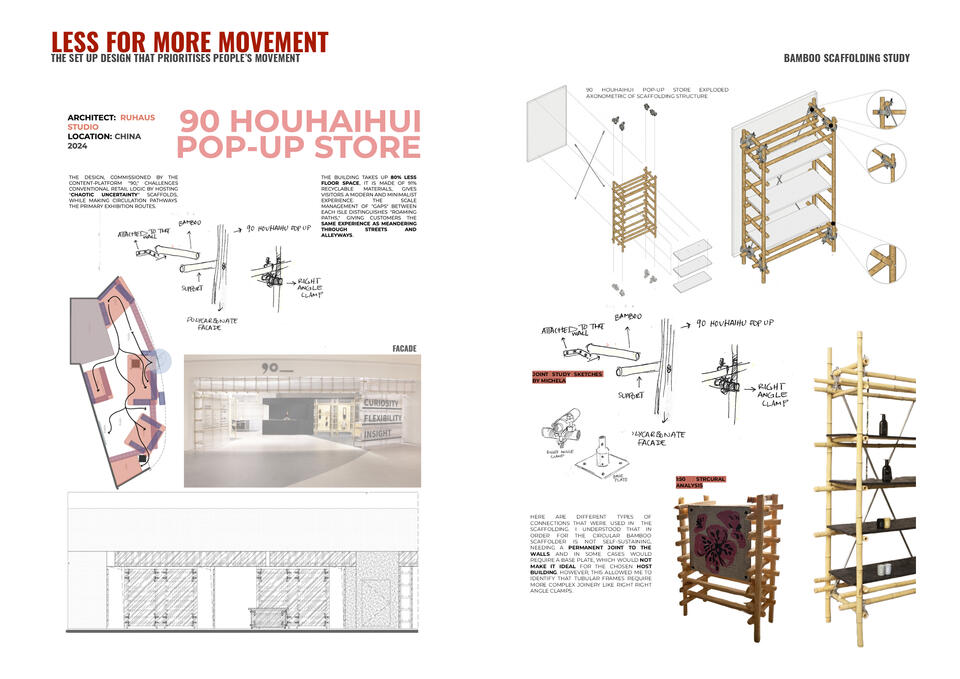
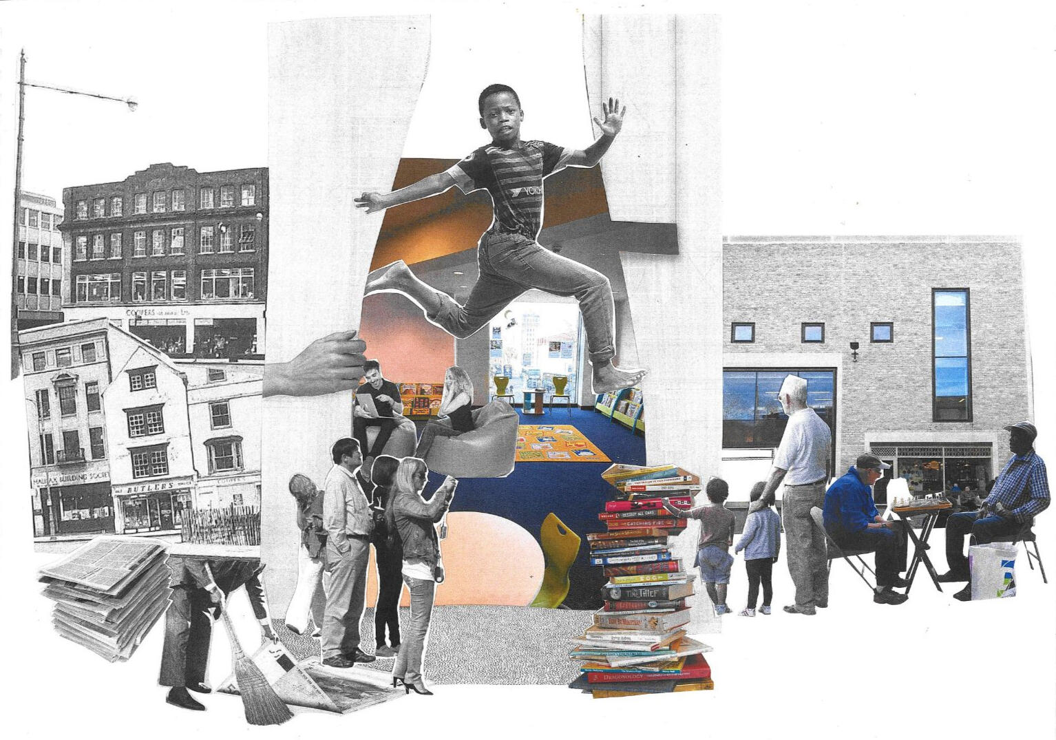
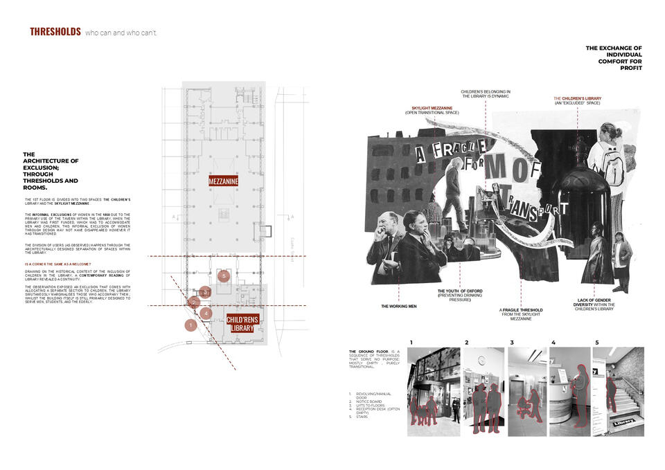
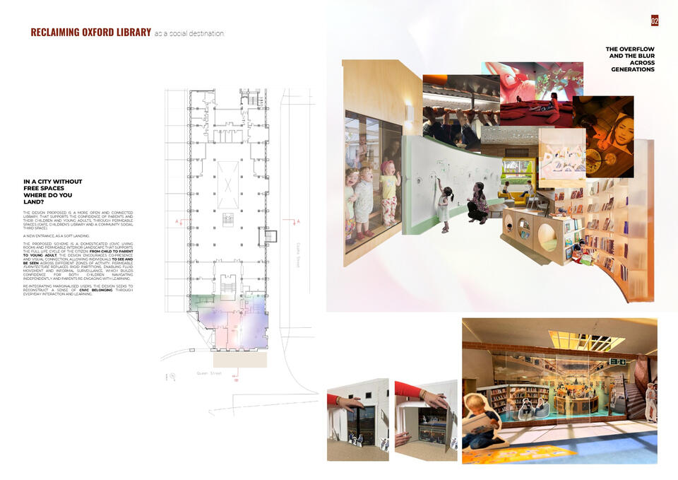
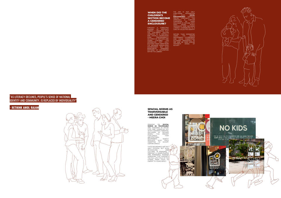
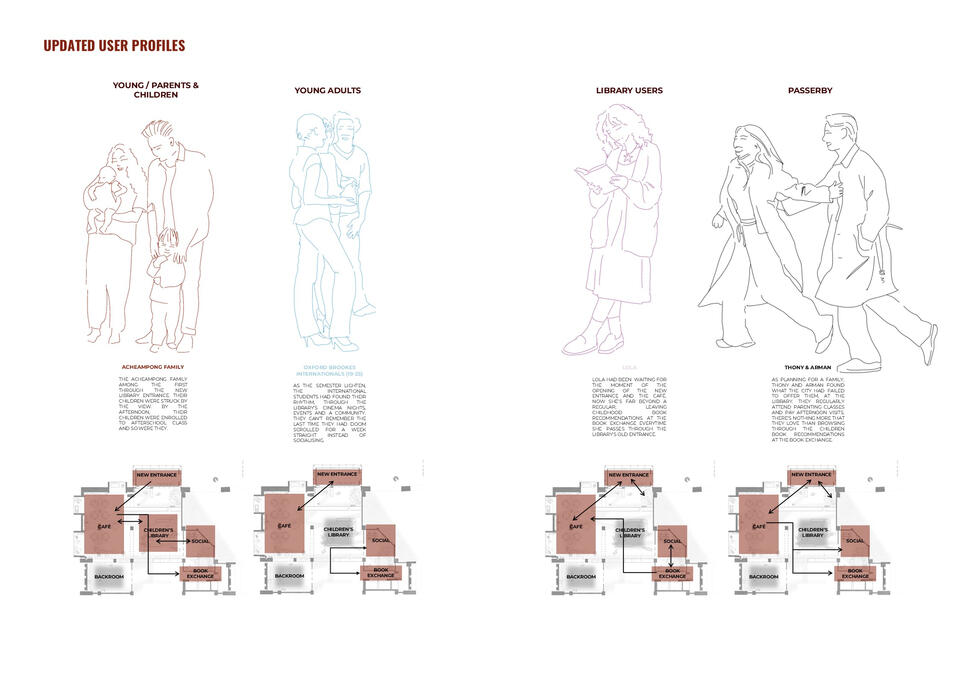
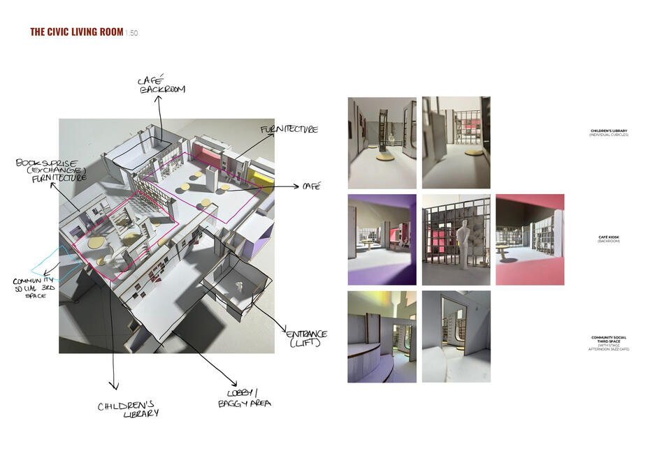
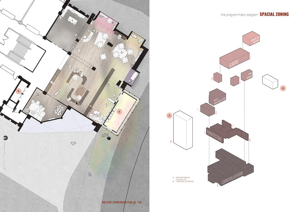
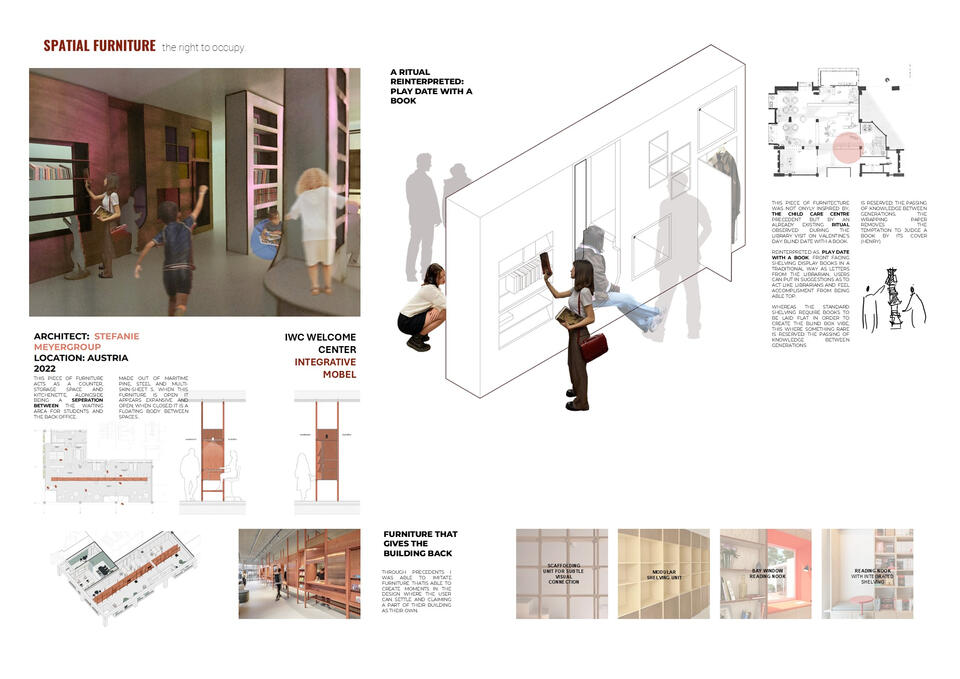
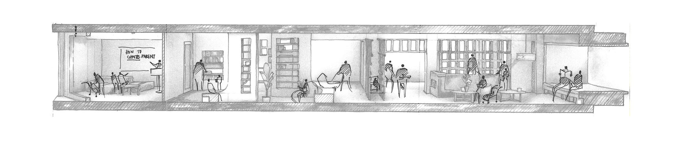
Returning to the Westgate Public Library for Semester 2, tasked with the re-organisation and enhancement of the 2nd floor, I chose the Children's Library and titled the design proposal In The Civic Living Room - Between Us.The brief pushed beyond the notions of published books. I answered with public debate, social events, and participatory initiatives, creating a third space into the floor, somewhere neither home nor school, but a place to gather, freely question, and belong.The proposal of a civic living room, open, domesticated, and permeable, through a new entrance acts as a soft landing, and the interior unfolds across three connected zones: a café, children's library, and community social space.Rather than rigid partitions, permeable furnitecture enables fluid movement and informal surveillance, building confidence for children navigating independently and parents re-engaging with learning.Drawn from Meera Choi and Youngcho Lee's work Spatial norms as traversable and gendered: A Study of Parental Experiences of No-Kids Zones In South Korea. Gender, Place, and Culture, the design challenges how architectural boundaries quietly regulate who feels permitted to occupy a space, not only physically, but behaviourally and culturally.The proposal reconstructs civic belonging through everyday interaction, supporting the full life cycle of the citizen: from child to parent to young adult.
And at its heart, a quiet act of generosity, a free alternative to the £4 Carfax Tower. The lift rises through an iridescent glass façade, Oxford seen literally through rose-tinted glass, delivering you to a cosy café, books all around, with extraordinary views of the city below.
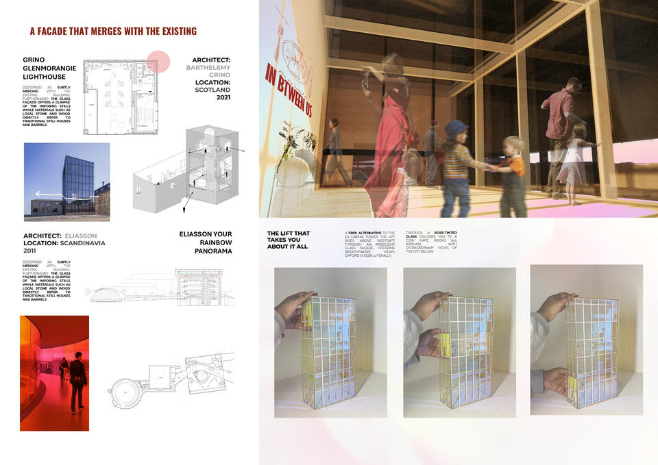
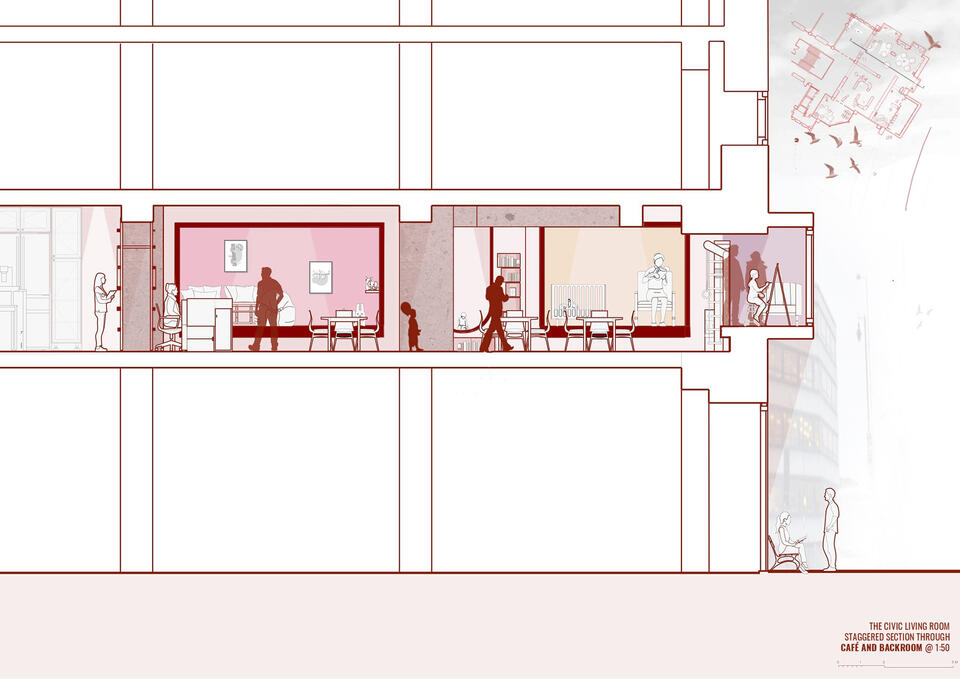
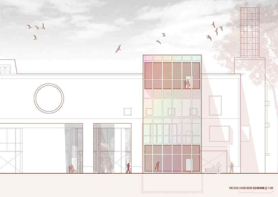
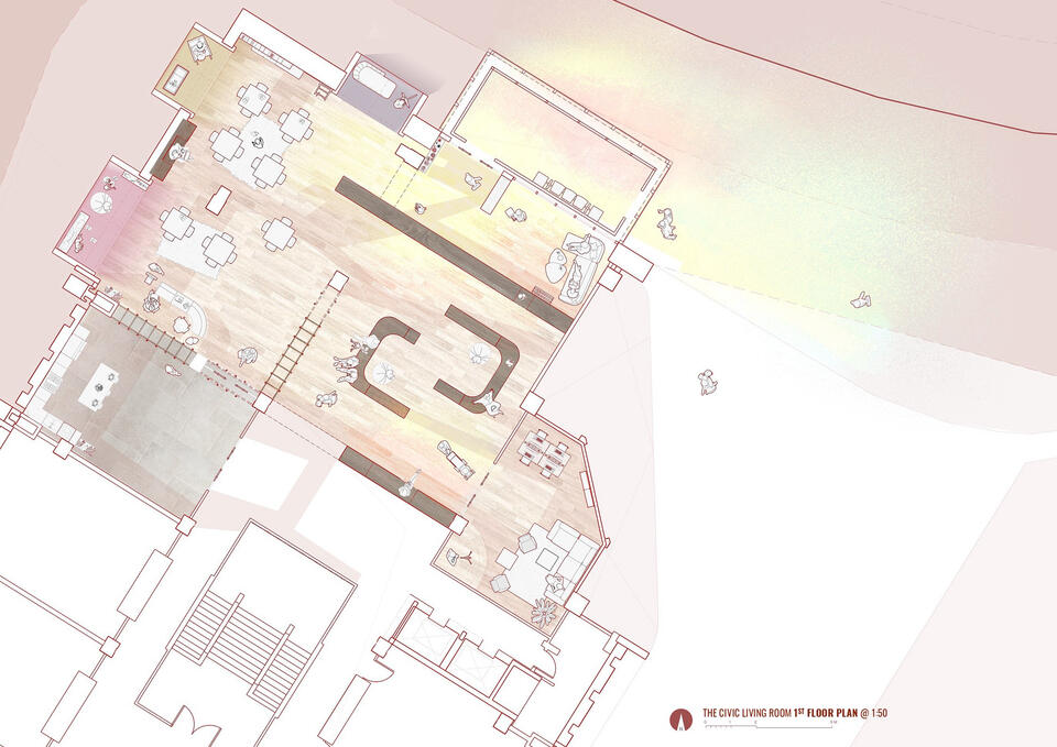
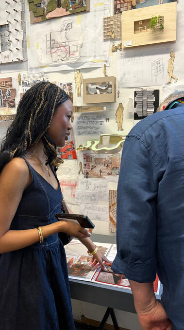
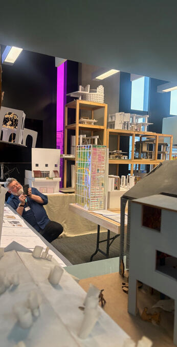
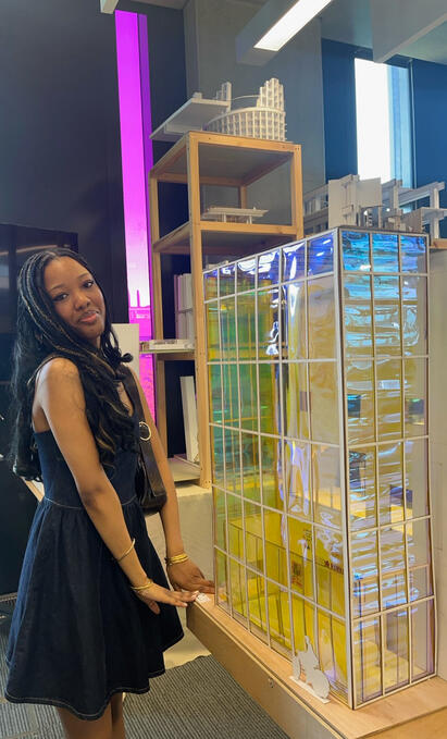
During my second year, I was honoured to receive the Paolo Placidi Memorial Prize for Interior Architecture, an award honouring Paolo Placidi's legacy, given annually to the Year 2 student who has shown the most significant progress on the BA (Hons) Interior Architecture.
ARTIST STATEMENT
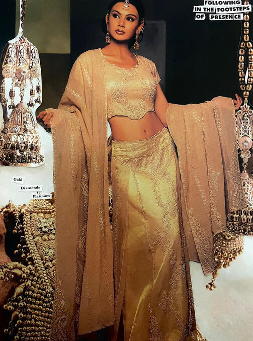
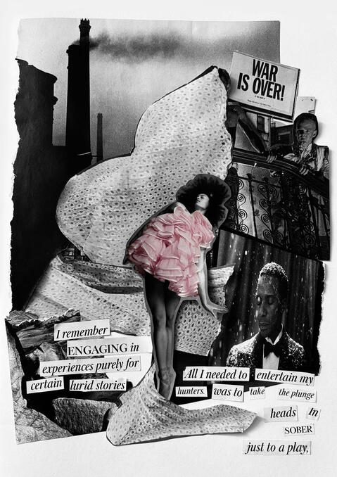
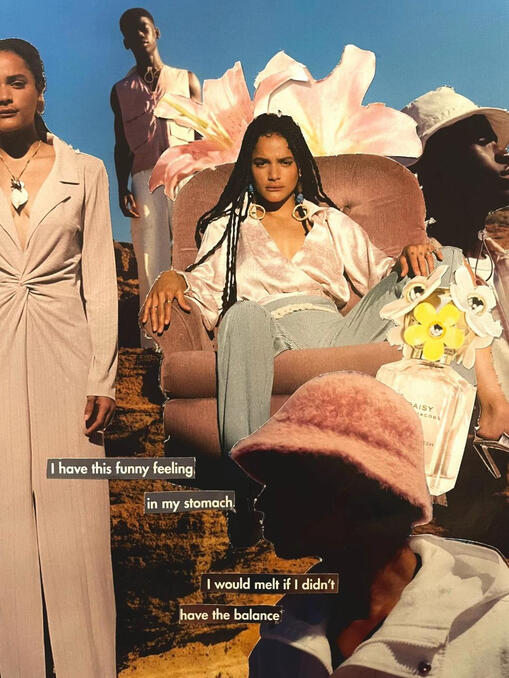
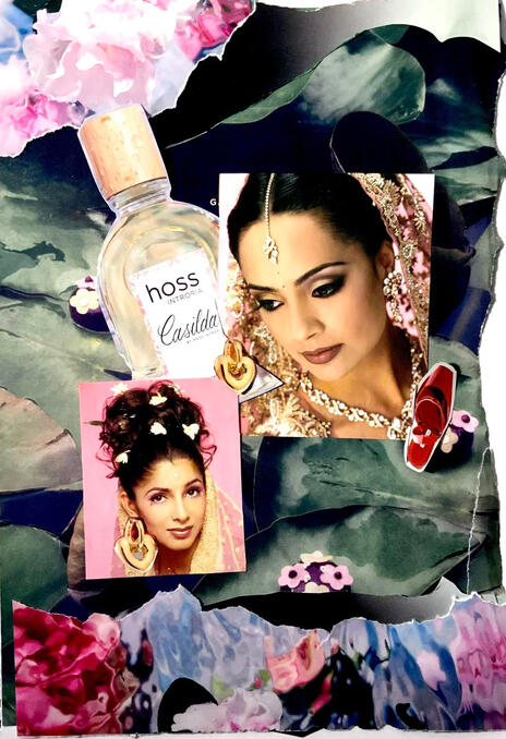
I am an multidisciplinary artist, going into my second year of a BA in Interior Architecture. This summer (2025) I have been focusing on a small collection Summer Interlude on 8.3"x11.7" watercolour paper, using watercolour as a main medium.When it comes to using watercolours, each piece I create carries something personal, a feeling, a story, a trace of growing pains turned tender, the way the mixing of the medium isnt certain just like the “Summer Interlude” collection of “unfinised” watercolour portaits to symbolise the things unsaid this summer, the amount of potential my art has.I explore the journey of self-discovery, anxieties and excitement that come with growing up. My practice is grounded in storytelling, and I create a space where I can celebrate the beauty of these complexities.Majority of my work is deeply influenced by the raw, sultry emotionality found in Richard Siken’s writing (Crush), that feverish intimacy, the urgency of feeling. I create in that same spirit: intuitively, instinctively, and entirely led by how I feel in the moment.I am to develop my art to critique consumerist culture by reusing old, forgotten paintings, further using more old magazines, transforming them into something meaningful, and giving them a second life. I want to create art that can be donated to charities, placed in coffee shops, sent as gifts, art that lives softly and speaks in quiet spaces. I also hope to sell my work, not only to support myself as an artist, but to help care for my family, friends, and community.Eventually, I want to use the revenue from my practice to invest back into Ghana; to cultivate young talent, to build, to donate, to plant, and to give others the space to dream and create.I’m grateful to have both the desire and the opportunity to make art, something that could have easily been lost, but was quenched and kept alive by the people who saw my potential and poured into it. That act of belief, of being seen, became the spark. Now, I hope to pass that forward.
thank you for being here!
ARTIST BIOGRAPHY
Makafui is a Ghanaian-Italian multi-hypernate artist working primarily with watercolour, acrylic, oil paint, collage, and digital mediums like Procreate and Photoshop. Her work lives in subtle colour palettes, layered textures, and emotionally intimate storytelling. She is currently living in London pursuing a BA degree in Interior Architecture.Her artistic journey began in childhood, when the bedroom walls she shared with her siblings became her first canvas. She formally studied Art, Media & Technology at GCSE, followed by Fine Art and Product Design at A Level, to Interior Architecture at university, and she continues to evolve her practice alongside her academic work. Her influences are rooted in both literature and music: the raw, feverish intimacy of Richard Siken’s poetry and the quiet emotional power of Sade’s (Helen Folasade Adu) music, particularly “Pearls” and “Jezebel.”Her work has appeared in group exhibitions and publications including Pure Wata Zine, Seymour Magazine and Artit Heat-Archives. She has worked on a series of unfinished watercolor portraits Summer Interlude. She is currently represented by ArtPulse London with prints available to purchase.Makafui’s practice resists perfection in favour of presence. Her work is emotionally driven, led by instinct, and often explores self-discovery, identity, and the tender complexity of coming of age. She believes art should be a place where contradiction, chaos, and softness can coexist freely.
thank you for being here!
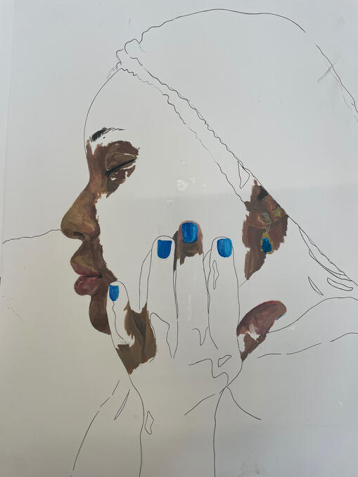
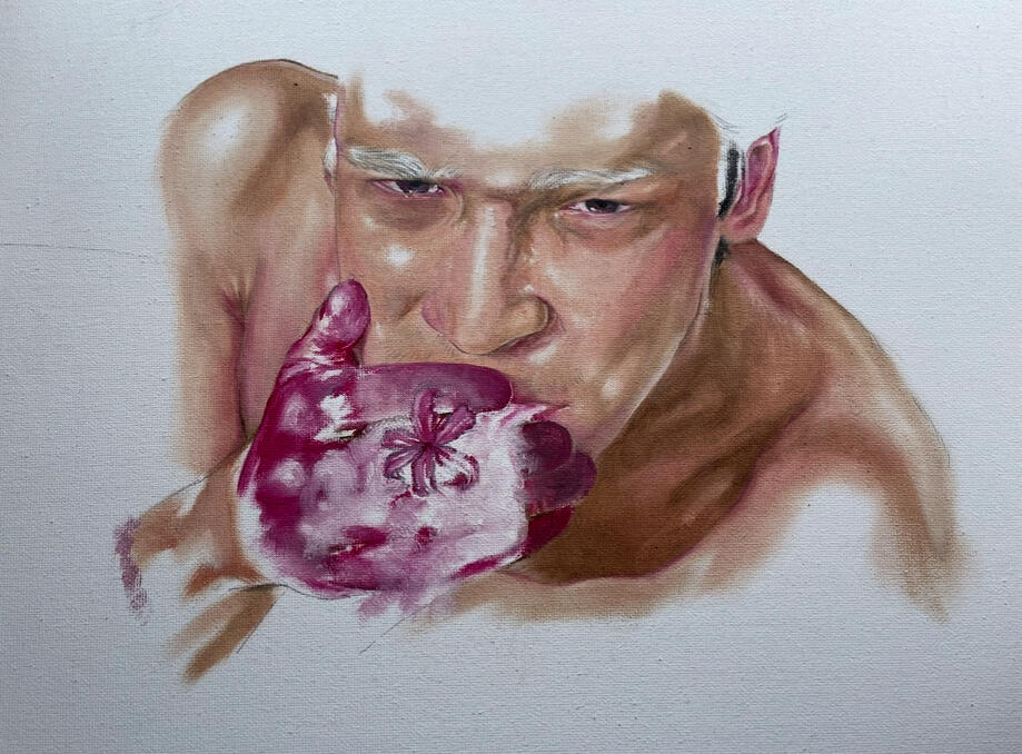
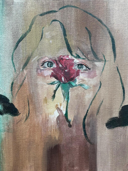
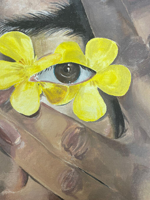
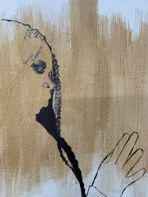
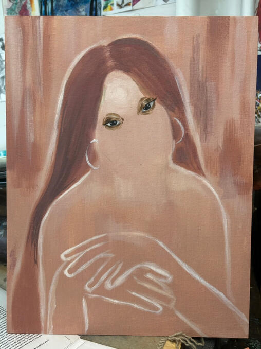
OIL PAINTINGS

Untitled, 2023
Untitled, 2023
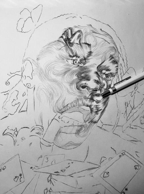
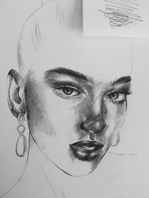
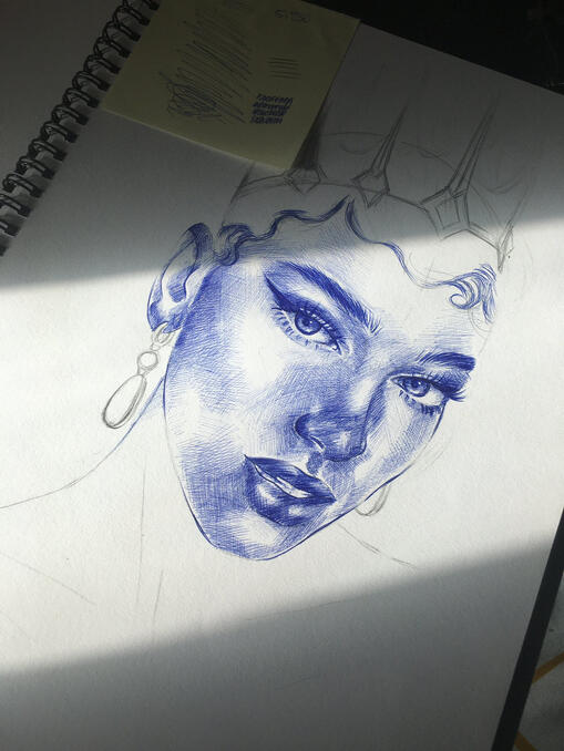
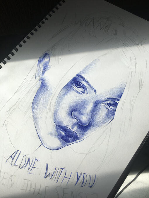
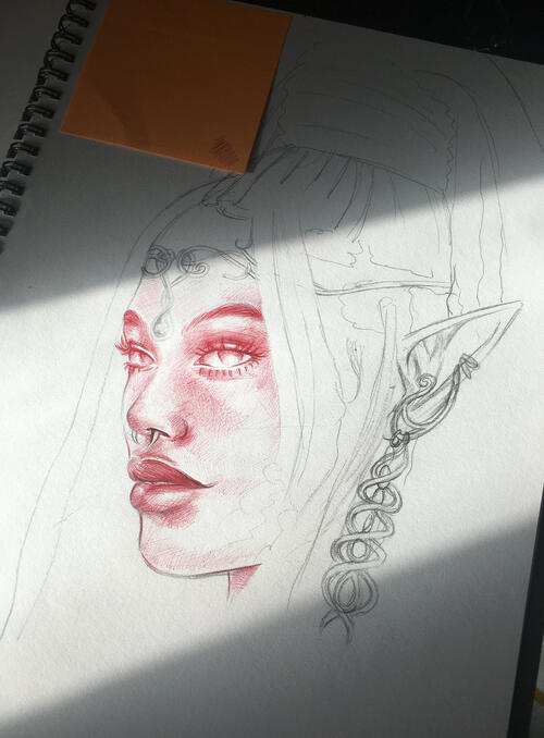
PEN WORK

Untitled, 2022

Untitled, 2022

Untitled, 2022

Untitled, 2022

Untitled, 2022
ACRYLIC

Untitled, 2023

Untitled, 2023

Untitled, 2023

Untitled, 2023
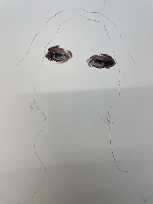
Untitled, 2023

Untitled, 2023

Untitled, 2023
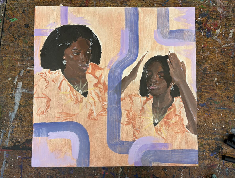
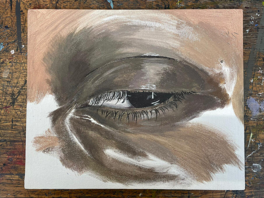
PENCIL ART

Untitled, 2022

Untitled, 2023

Untitled, 2022
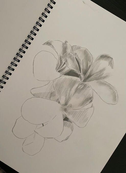
Untitled, 2022
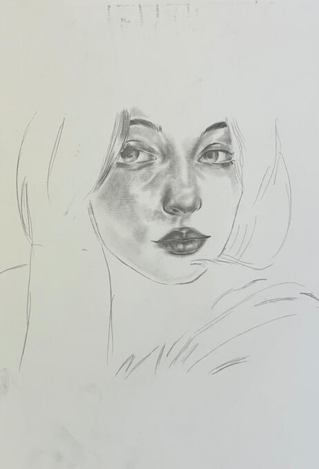
Untitled, 2023
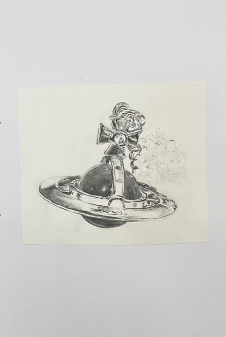
Untitled, 2023
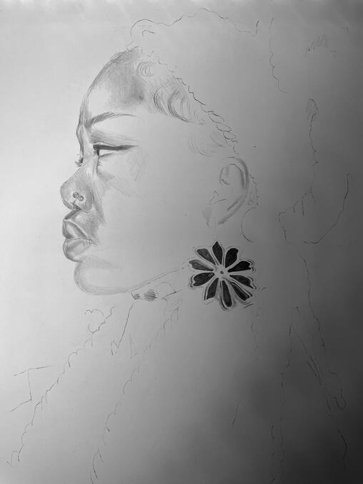
Untitled, 2023
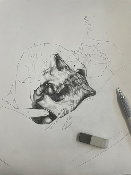
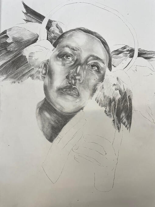
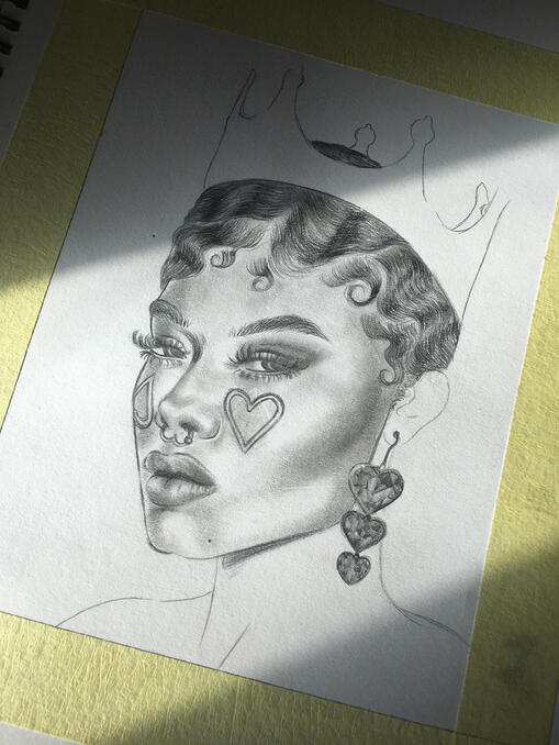
WATERCOLOUR ART

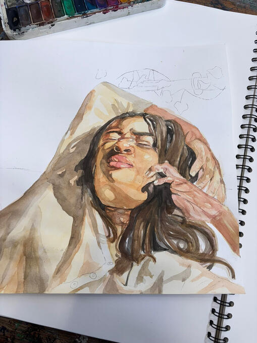
Sleep Through Your Alarms, 2023

August Love Galore, 2025

Dawn In The Sun, 2025

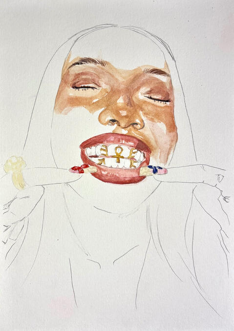
Come Closer Mo, 2025

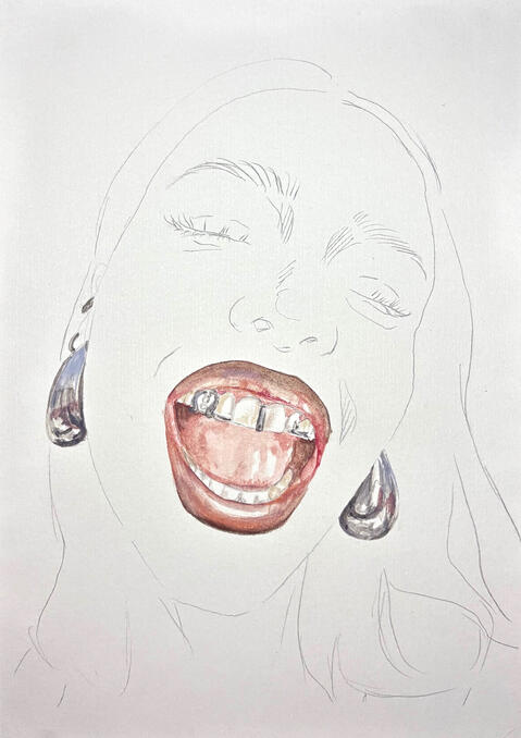
Requiem Of A Dream, 2025
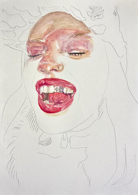
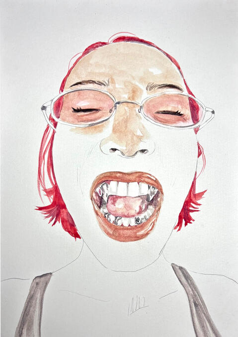
DIGITAL ART

Untitled, 2025
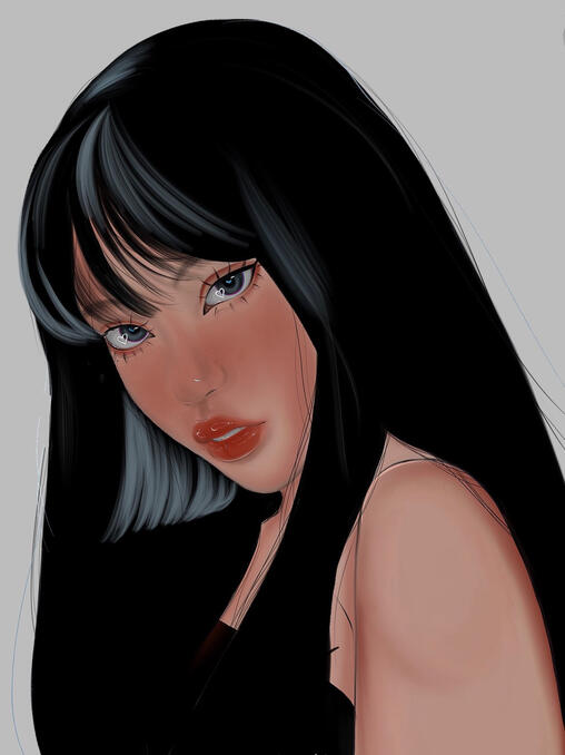
Untitled, 2022
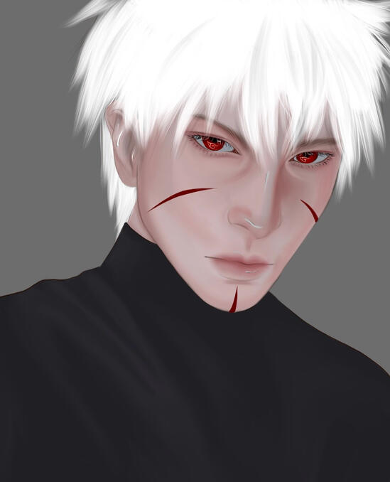
Untitled, 2022

Untitled, 2022
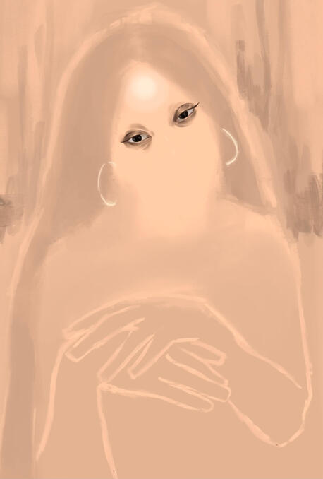
Untitled, 2023
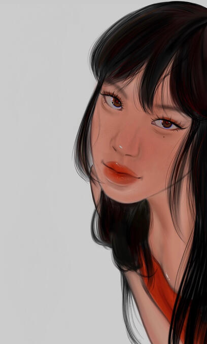
Untitled, 2023
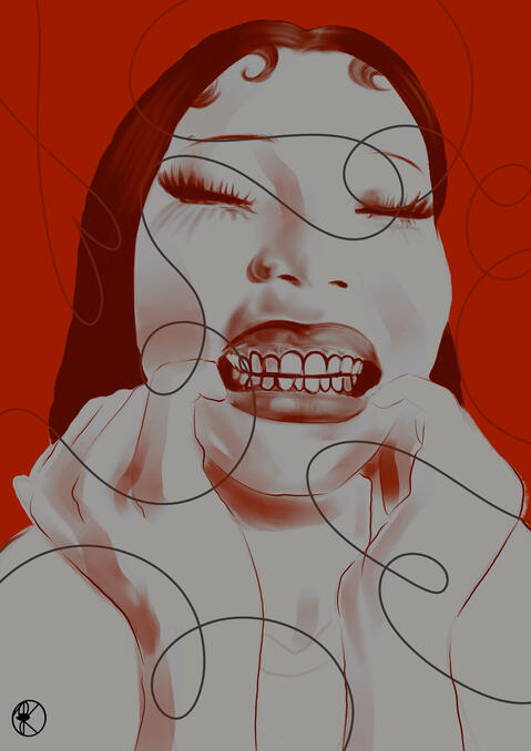
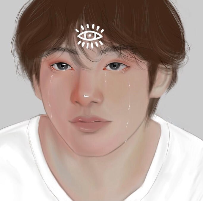
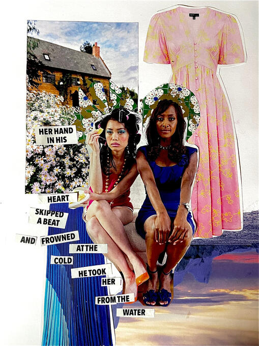
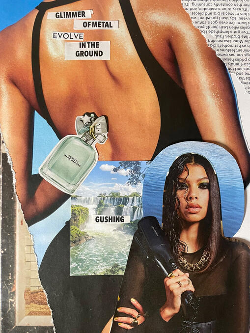
DIGITAL COLLAGE

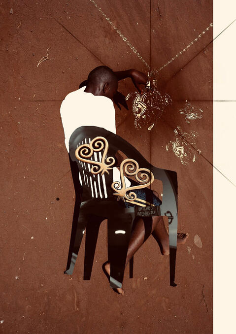
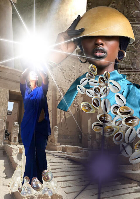
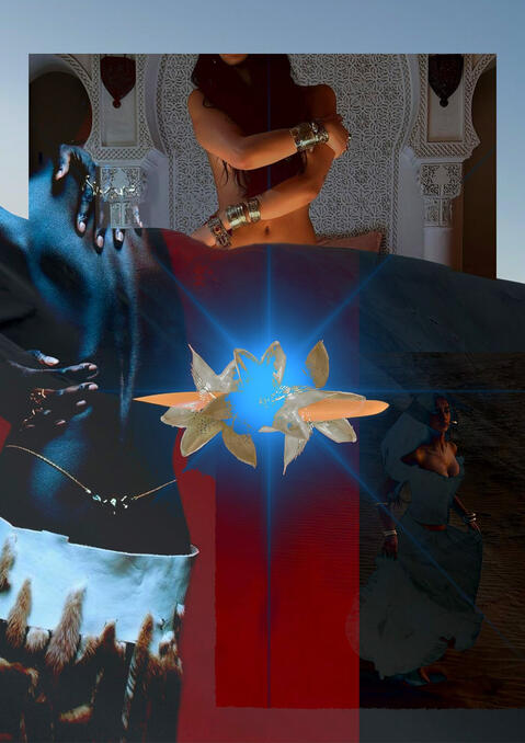
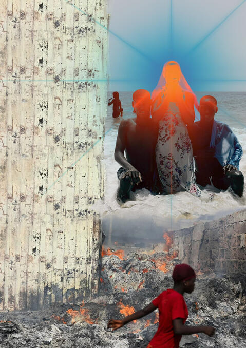
Amourosly Yours, Me Do, 2025

Me dɔ wo yɛ nyamewa, 2025

All My Devotions Turn Violent, 2025

I Will Die Your ba baa, 2025

Backstreet Sweetheart, 2025

AIDOWFTBS, 2024

Untitled, 2023
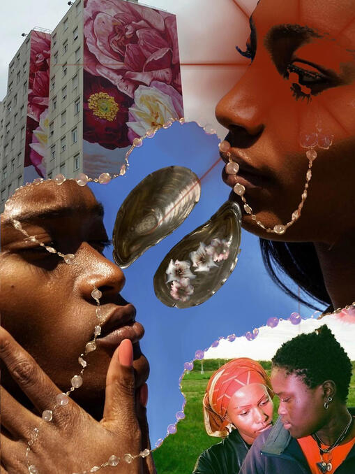
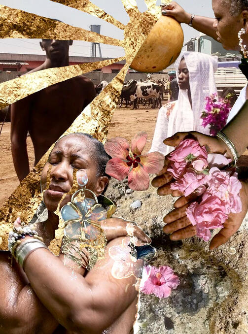
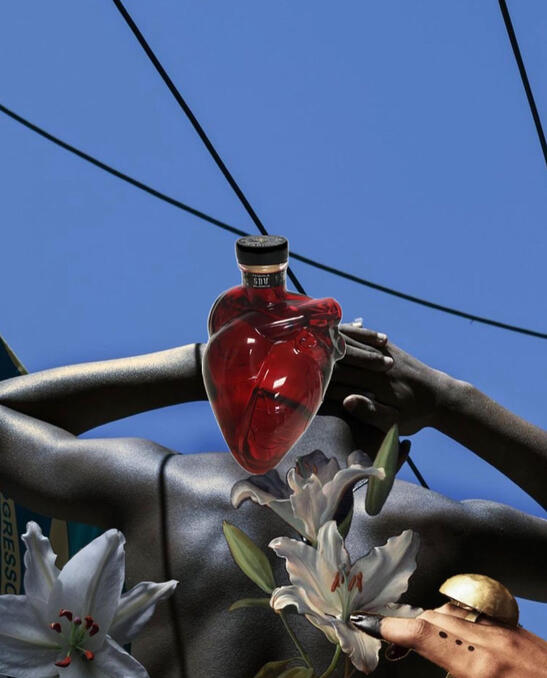
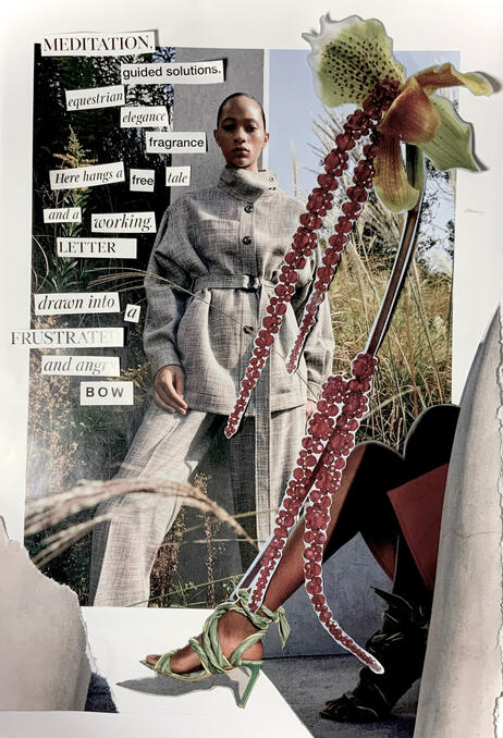
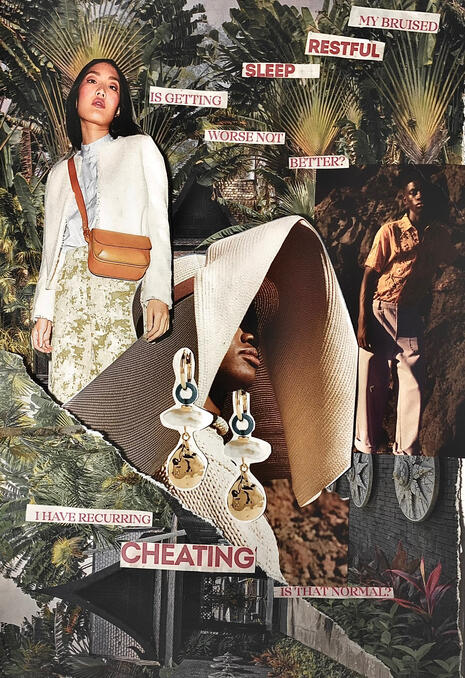
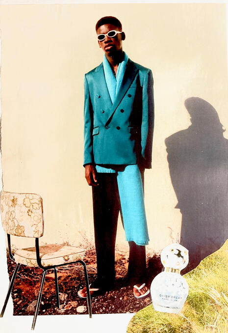
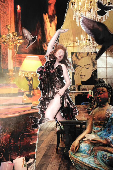
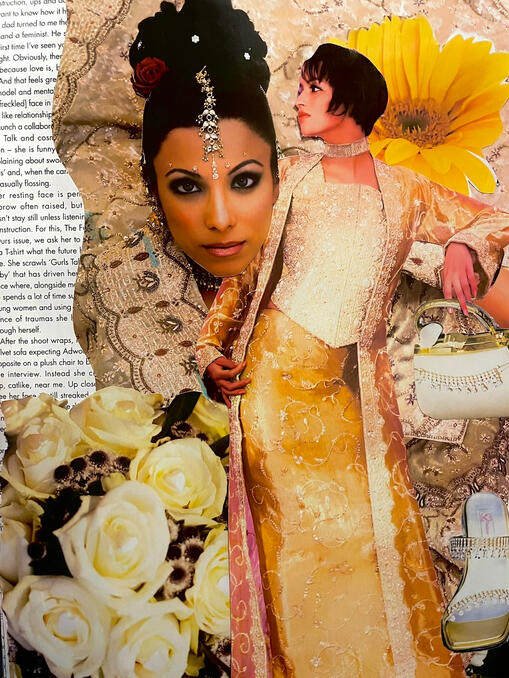
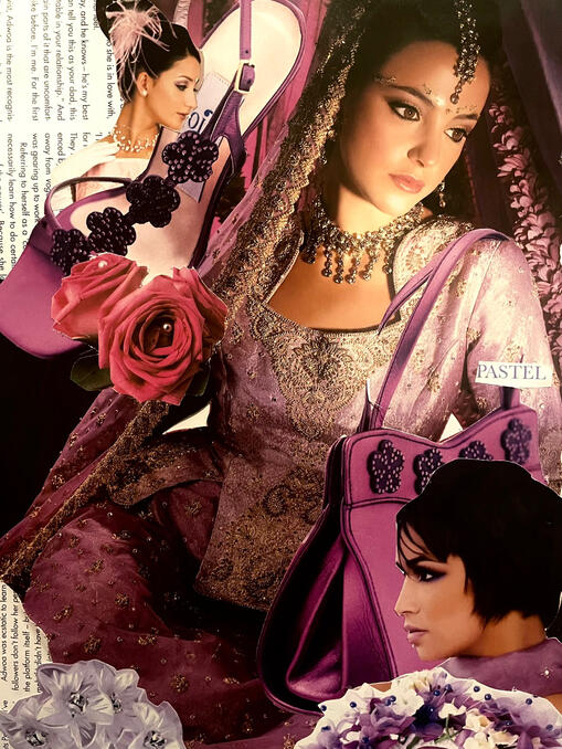
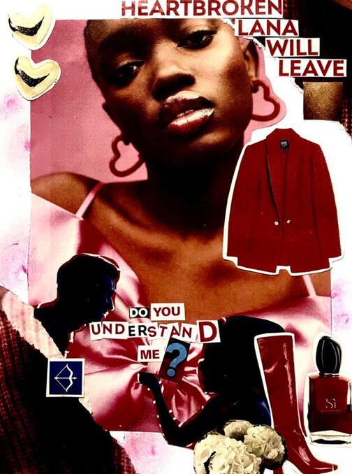
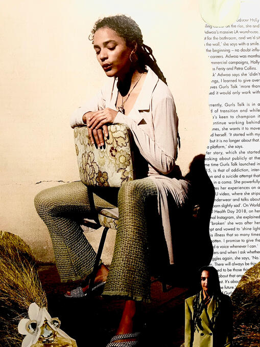
COLLAGE ON PAPER

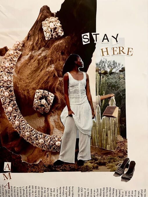
Ama, My Love, 2023

I Must Say It's A Necessity, 2023

Jezebel, 2025

Before You, 2023

Oh! To Be Me, 2023

Working For The Knife, 2023

You, Relentless You! 2023

Daisy Boy, 2023

TOWOITMM, 2024

IDWTTAH, 2023

IFWIWSE, 2023

The Colour Yellow, 2023

The Colour Purple, 2023

Do You Understand My Sign, 2023

Untitled, 2023
SUMMER INTERLUDE
My ongoing collection, Summer Interlude, is a series of intimate, unfinished watercolour portraits that I’ve been creating at a pace of around one per day since early June of the year 2025. While the body of work is still growing, the idea is that only a carefully selected few will be displayed on my social media, making the experience feel quiet, close, and deeply personal.The vision is to create a space that encourages “forced proximity,” inviting the audience into close physical and emotional contact with the work. The fewer pieces allow each one to breathe, giving visitors space to reflect and interpret. The experience becomes a conversation, not just between the viewer and the work, but among viewers themselves. I want people to linger, to share what the titles and expressions evoke for them, to speak the things that often go unsaid, just as the unfinished and complex nature of the watercolours suggests. At its heart, Summer Interlude is about pause and transition: the quiet moments that shape us and the things we carry but never name.The concept is also inspired by my favourite childhood show, Mia and Me, a live-action/animated hybrid children's television series created by Gerhard Hahn, where the characters (Mia, Mo and Yuko) search for scattered pieces of a powerful object, the Trumptus, in Centopia. Mia isn’t always guaranteed to completely finish a mission or find a piece of the Trumptus, often having to leave back to the real world, which resonates with my pursuit of academic validation at the expense of my creative calling. Similarly, the experience becomes just one part of a larger narrative.To experience the full story, viewers will have to follow through my art account and follow along as I grow not just as an artist, but also as a poet. These pieces becomes a breadcrumb trail, an invitation to search, to feel, to connect.
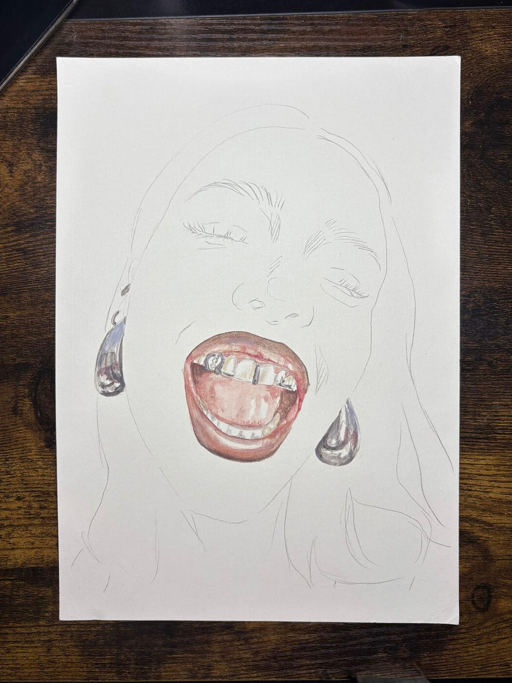
August Love Galore, 2025
8.3"x11.7" (Watercolour on Paper)
£222
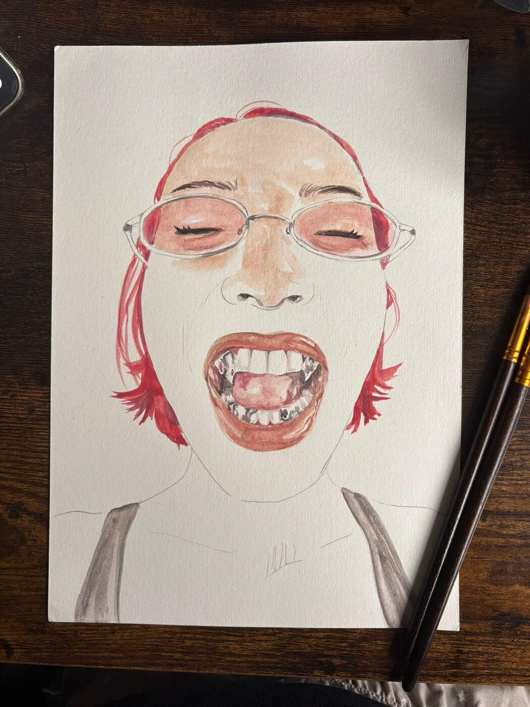
Requeim of a Dream, 2025
8.3"x11.7" (Watercolour on Paper)
£222
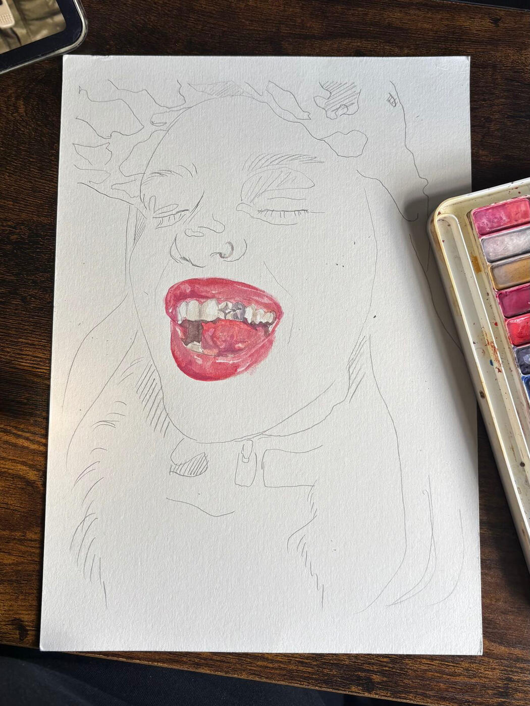
Look Closer Mo, 2025
8.3"x11.7" (Watercolour on Paper)
£222
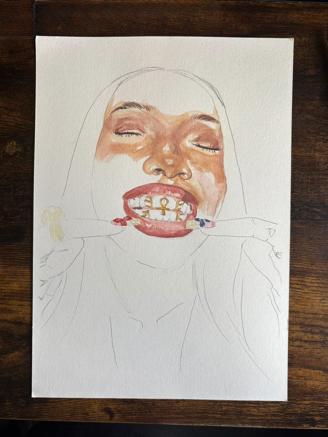
Dawn In The Sun, 2025
8.3"x11.7" (Watercolour on Paper)
£222
thank you for being here!